Category Archives: HIST696

Mapping History

From this week’s readings, it appears that there has been some disconnect between historians and geographers in the past. However, there has been an effort made by digital historians recently who have gravitated towards geographic information systems (GIS) to link the two fields together for scholarly purposes. Tim Hitchcock suggests that this division was partially due to geographers’ seeking more secure academic funding by aligning themselves with STEM departments rather than with history/humanities and as a result, there has been little dialogue between the two fields. However, the availability of user-friendly GIS programs and mass digitization of historic texts and lots of data, have opened the doors to collaboration between history and geography in a digital format. History can now be geo-referenced, as historical maps can be digitized and layered, as well as analyzed, as the examples covered illustrate.

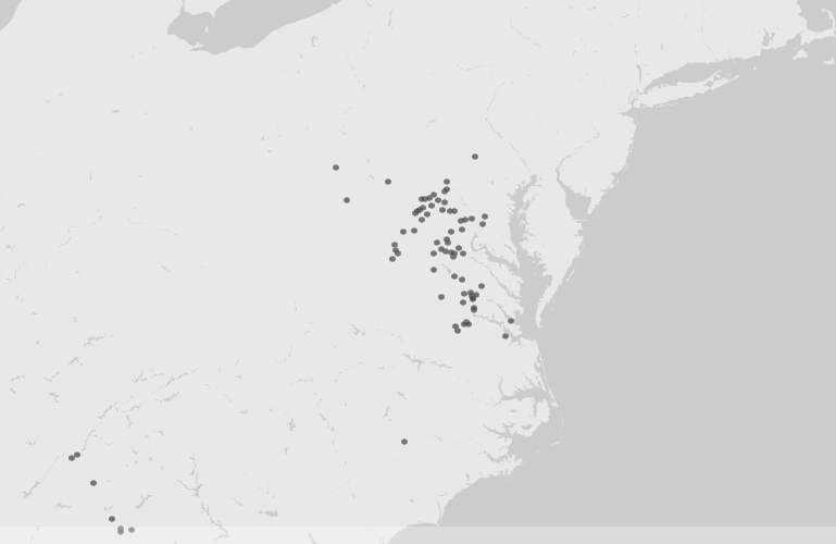
The Visualizing Emancipation project is a prime example of how mapping historical data can reveal patterns through imagery. I could spend all day playing with Visualizing Emancipation. By allowing the user to select an Emancipation Event, such as the “Capture of African Americans by Union troops” or “Conscription/Recruitment” by either the Union or Confederate Armies and filtering by source type, such as book, official records, newspapers and/or personal papers, researchers are able to explore a previously primarily text-based set of documents in a visual geographic manner. This pairing is helpful to those, like myself, who like to match a document to its complete history, including its geography. With adjustable map options, users can choose how they want to visualized the data presented to them and click on specific events to learn about its details. One of the tool’s most handy features is its ability to link directly to the actual source material that is geo-referenced, as it allows users to interpret the data for themselves. The map visualization helps us to take on a new perspective on such a large topic on different scales, allowing us to expand and contract our view of emancipation in a geographic way.

On a smaller scale, geographically, Digital Harlem is somewhat similar to Visualizing Emancipation, in that historical records have been geo-referenced to reveal patterns of daily life in Harlem from 1915 – 1930. By selecting a type of event, the name of a person or place, users can create custom maps that plot each event, with their descriptions as well. Multiple layers can be built on top of a Google map and/or an historical map, helping us to visualize the geographic display of archival sources, such as crime records and newspapers.

With GIS, historians can use maps to explore historical themes, such as with the ORBIS project from Stanford. Both take historical data and apply it to a map, which ORBIS allows researchers to not only map the Roman Empire, but also calculate travel routes with respect to seasonal changes, modes of transportation, and expenses. It differs from the above examples in that it is not a tool to plot specific events, but it models various outcomes by using criteria set by the user based on historical data.

All of the tools covered in this week’s reading each combine history and geography to create customizable and interactive maps that can help us gain a new perspective on the historical record. This pairing has benefited from the digitization of documents and advances in/ increasing availability of GIS software and tools, and I can only see an increase in scholarship that utilizes such tools.

Testing Out Network Visualization Tools

This week in class, we looked at a few different data visualization tools, such as RAW and Palladio. After class I attempted to try out the tools on my own, which was kind of fun. I like being able to visualize information in a non-textual format, especially when you can use fun colors like RAW allows you.

Using a dataset provided by Dr. Robertson that connects Civil War units with corresponding battles, I created a visualization with the Alluvial Diagram option. RAW allows you to customize the size and color, which I did by enlarging the height (1500px) and width (500px), and changing the colors to ones I thought looked good to me, but were also distinct, as you can see below.

Aldie 2AldieAtlanta 1AtlantaAverasboro 1AverasboroAylett’s 1Aylett’sBealton Station 1Bealton StationBeaver Dam 1Beaver DamBentonville 1BentonvilleBerryville 1BerryvilleBethesda Church 1Bethesda ChurchBeverly Ford 1Beverly FordBrandy Station 1Brandy StationBrentsville 2BrentsvilleBull Run 4Bull RunCassville 1CassvilleCedar Creek 1Cedar CreekCentreville 1CentrevilleChancellorsville 3ChancellorsvilleCharles City Courthouse 1Charles City CourthouseCharlestown 1CharlestownChattanooga 1ChattanoogaCold Harbor 2Cold HarborCross Keys 2Cross KeysCulpepper Court House 2Culpepper Court HouseDallas 1DallasDeep Bottom 1Deep BottomDinwiddle 1DinwiddleFairfax Courthouse 1Fairfax CourthouseFalling Waters 1Falling WatersFisher’s Hill 1Fisher’s HillFive Forks 1Five ForksFort Scott 1Fort ScottFredericksburg 1FredericksburgFront Royal 2Front RoyalGaines Mill 1Gaines MillGettysburg 4GettysburgGrove Church 1Grove ChurchGroveton 1GrovetonHagerstown 1HagerstownHalltown 1HalltownHanover Court House 1Hanover Court HouseHarrisonburg 1HarrisonburgHartwood Church 1Hartwood ChurchHawes’s Shop 1Hawes’s ShopHope Landing 1Hope LandingJefferson 1JeffersonJones Cross Roads 1Jones Cross RoadsJones’ Bridge 1Jones’ BridgeKelly’s Ford 1Kelly’s FordKenesaw Mountain 1Kenesaw MountainLaurel Hill 1Laurel HillLeetown 1LeetownLiberty Mills 1Liberty MillsLuray 1LurayMalvern Hill 1Malvern HillMiddleburg 2MiddleburgMiddletown 2MiddletownMilford Station 1Milford StationMine Run 1Mine RunMonterey 1MontereyNew Creek Station 1New Creek StationNew Market 1New MarketNorth Anna 1North AnnaOld Church 1Old ChurchOpequon 2OpequonPeach tree Creek 1Peach tree CreekPetersburg 1PetersburgPicket 1PicketPiedmont 1PiedmontPiney Branch Church 1Piney Branch ChurchPoplar Springs 1Poplar SpringsPort Republic 1Port RepublicPrince George Court House 1Prince George Court HouseRacoon Ford 1Racoon FordRapidan 1RapidanRapidan Station 1Rapidan StationRappahanock Station 3Rappahanock StationResaca 1ResacaRichmond 1RichmondRobertson’s River 1Robertson’s RiverRobertson’s Tavern 1Robertson’s TavernRood’s Hill 1Rood’s HillShepherdstown 2ShepherdstownSmithfield 2SmithfieldSnicker’s Gap 1Snicker’s GapStone Mountain 1Stone MountainStrasburg 1StrasburgTodd’s Tavern 1Todd’s TavernTom’s Brook 1Tom’s BrookTotopotomoy 1TotopotomoyTrevilian Station 2Trevilian StationTurner’s Ferry 1Turner’s FerryUpperville 1UppervilleWauhatchie 1WauhatchieWeldon Railroad 1Weldon RailroadWhite House 1White HouseWhite Post 1White PostWilderness 2WildernessWillow Springs 1Willow SpringsWinchester 1WinchesterYellow Tavern 1Yellow TavernYorktown 1Yorktown136th New York Infantry 14136th New York Infantry1st Michigan Cavalry 281st Michigan Cavalry29th New York Infantry 629th New York Infantry44th New York Infantry 2244th New York Infantry4th New York Cavalry 544th New York Cavalry

I used the same dataset as above with Palladio, which offers visualization options such as maps, graphs, lists, and galleries. I had some trouble trying to extend the Battles to include their location coordinates, but after reading the FAQ I realized that I needed to identify the new data as “place, coordinates” for it to display properly. I was able to create a moveable graph with the nodes (the units) connecting to the battles, and with the location coordinates I was able to see the battles displayed on a map. Unfortunately there are no embedding options that allow for interactivity, so I’ve taken a screenshot of the map. On the live version, you can click on on hover over each dot to reveal the name of the specific battle.

Palladio screenshot, map view

After playing around with RAW and Palladio, I took a shot at Gephi, which requires a download and installation. Even after re-reading Elena Friot’s tips and personal experience with Gephi, I still didn’t quite grasp its usefulness. I added the data in as described, but all I got were a cluster of dots that I didn’t know what to do with. I much prefer the more user-friendly interfaces of RAW and Palladio, and I’m trying to think of ways to use them in my own research. I could try creating a dataset from the Henry Schweigert diaries that link the diary entries by date to locations in which they were written, or what subjects are mentioned in them, in order to gain a different perspective of the overall patterns in the diaries.

Visualizing Networks

This week’s readings on networks started off a bit confusing to me, but by the time I ended up at Weingart’s Networks Demystified series, I felt like I had learned the ins and outs of networks, more or less. I had never given much thought to the visualization of networks, nor how historians, humanists, or social scientists have been using them before, which may have explained my bewilderment with some of the week’s articles. I’ve come to understand that networks are basically connections between things, usually people. However, there can be many factors that play a part in these networks that we as historians should try to take into account.

One example, cited by several of this week’s authors, is John Snow’s cholera map showing how the 1854 outbreak began in London. John Theibault writes that Snow’s map presented a narrative, as well as analysis of the epidemic, and leaves it at that. Meanwhile, Johanna Drucker takes Snow’s map a bit further, putting into question just who all those dots were socially and demographically, as well as providing us first with a street map with plotted dots, and an updated version of the map that replaces the dots with actual humans. The human figures on the map help illustrate that each dot from Snow’s map represents a single individual, reminding us that there is more information than meets the eye in all data.

What has helped me understand the purpose of visualizing networks were Klein’s article on archival silence and data visualization in regard to Thomas Jefferson’s communication with James Hemings, who was Jefferson’s slave and chef, and the Mapping the Republic of Letters project, in particular the case study of Benjamin Franklin. Both utilize correspondence data to show patterns of communication. In Jefferson’s case, although he did not directly communicate with Hemings, the digital version of the Papers of Thomas Jefferson contains an editorial note about Hemings, as he was mentioned in his letters to other people. From this, the author was able to chart the frequency Hemings was mentioned and also in which correspondence he was referred to. This visual aid helps to show us how Jefferson communicated about Hemings, which would not be known if only relying on letters written directly to him, which were none.

More general patterns can be seen in Franklin’s letters, such as which country he was receiving letters from most during a particular time frame, what kinds of people he was corresponding with (professionals, artisans, etc), and his top correspondents. This approach helps answer questions about Franklin’s correspondence that might take large chunk of time to extrapolate, which is one of the benefits of visualizing networks.

Playing with Patterns

I tracked the usage of the word “railroad” with Google ngram viewer, Bookworm: Chronicling America, and NYT Chronicle and found some interesting results that you can see for yourself below.

I wanted to see how the word railroad appeared in historic newspapers from the Library of Congress’ Chronicling America collection. I was able to view results from 1840 – 1921 with  Bookworm: Chronicling America and saw how the word railroad peaked in 1873 with a frequency rate of 58.9. I expected a larger spike for 1877, the year of the Great Railroad Strike, but this it could be a reflection of the newspapers available in Chronicling America. The Panic of 1873 could very well be the reason for the highest rate of the word I search, since the depression followed a large boom in railroad expansion.

Bookworm: Chronicling America, railroad

With NYT Chronicle, which only tracks the usage of words in the New York Times, I noticed a different pattern. I changed the default setting to reflect the actual number of articles that mentioned railroad and saw the highest amount in 1930 with 6,763 articles, followed closely in 1902 with 6,682.  In 1851, the earliest date available, we see that there were only 357 references to railroad. During the Panic of 1873 there were 4,015 articles that mentioned railroad, after a period of steady rising through the Civil War. After the peak in 1930, a steady decline can be seen, eventually getting down to 616 articles in 2013. So far, in 2014, there have only been 465 articles with the word railroad mentioned.

NYT Chronicle: railroad

I used two terms when searching Google Books’ ngram viewer, train and railroad, just to see how they compared. Except for the earliest years searched, 1840 -1860, the two words show up almost with the same frequency, except for a slight dip with railroad between 1890 and 1900. With Google Books, we can’t see where the words are coming from, which is truly a case of distant reading.

When compared to Voyant, the ngram viewers mostly obscure the content that is being text mined. With Voyant, you see the entire corpus that you select to upload, and then see the pattern within that text. For my Voyant example, I uploaded the text of the 1869 diary of Henry Schweigert, a farmer/college student who lived from 1843 – 1923 in southeastern Pennsylvania. He kept diaries from 1869 – 1881 and I have been in the process of transcribing them and so far only have 1869 completed, the year he attended the now defunct Palatinate College in Myerstown, PA. I was curious to see what the patterns were with this text, as I was relatively familiar with the content.

As I expected, the words day and nice show up frequently, as well as college, home and Myerstown. Schweigert’s diary entries are brief and focus on the daily weather, his location, and any events or activities he had during the day. I removed the typical stop words such as the, and, and also the year 1869, as that showed up quite often as it was mentioned in every entry. Other noticeable words are church, excelsior (he was a member of the Excelsior Literary Society), brother and thrashing (as in thrashing wheat).


Text Mining and Visualizing History

This week’s readings on the topic of text mining has helped me to understand a little bit more clearly just why historians might want to consider such an aspect of digital history. Text mining and topic modeling can both help reveal new patterns and themes about events, people, and documents that might otherwise have been overlooked. When information is presented in a visual map, whether it’s a chart or graph, or even word cloud, that information takes on a new perspective that researchers can choose to investigate more fully, although it is important to remember the context that surrounds the original data.

I’ve come to realize that I am very much a visual learner, which makes text mining and topic modeling quite interesting to me. By seeing the data maps that Cameron Blevins used in his article by using a program that measured the instances of geographic locations mentioned in two Houston newspapers during the 1830s/1840s and then later in the 1890s. The idea of “imagined geography” was new to me when I read the article and accompanying website, and I think it is aptly named. At the time when the newspapers’ articles, features, railroad schedules, etc were being written, I hardly doubt that anyone was thinking of all of the locations that were being referenced, nor their sociological/historical impacts.

Having read Ted Underwood’s tips for starting your own text mining project before diving into Blevin’s or Kaufman’s Quantifying Kissinger project, I had a basic understanding of the large amount of text needed for such undertakings. Underwood’s FAQ style post puts the idea of text mining into easy to understand concepts, which I found most helpful. When I saw the Wordle example, I though, “hey, I’ve done that before!” which put a personal connection to this week’s readings. Then I tried out Google’s ngram viewer, which is a cool tool for visualizing the usage of a word or phrases over time, but clearly the context is lacking, especially since we can’t see which texts are being searched.

Moving on from last week’s discussion about “buckets of words,” this week’s readings tell how we can take those buckets, do our keyword searching, and find out how those words stack up across time, for whatever it’s worth. While I think text mining definitely has a cool factor because of its employment of data maps, which I really find helpful, I need to remember that due to poor OCR and lack of context, text mining is just another tool to use in the grand historian toolbox.

Using Databases in Scholarly Articles

While looking through the last three years of the journal Enterprise & Society, it is obvious that more historians have incorporated electronic databases into their research within the last year than in previous years, but I am not sure why. Maybe the editors have relaxed their restrictions on databases (if there ever were any), or the author’s have been more transparent about what sources they are using. Or maybe there just are more databases being used in these later articles. The journal’s standard bibliography of works cited is parsed out by the various types of sources used, and while some articles include databases in the “primary sources” category, there is no specific heading for electronic resources.

In Sept 2013’s issue, Matthew David Mitchell searches Voyages: The Trans-Atlantic Slave Trade Database in his article, “‘Legitimate Commerce’ in the Eighteenth Century: The Royal African Company of England Under the Duke of Chandos, 1720–1726.” By searching the database with the parameters of 1698 – 1807, Matthew was able to quantify the number of slaves brought by independent British slave traders to the Americas, in addition to those brought by the Royal African Company. I actually had not heard of this database before, so its inclusion in the references was informative in itself.

This month, in Sept 2014’s issue, Paula Cruz-Fernández takes her research in another direction in her article,  “Marketing the Hearth: Ornamental Embroidery and the Building of the Multinational Singer Sewing Machine Company.” While the author cites many historical periodicals, such as Godey’s Lady Book and Harper’s Bazaar, she also is clear about how she accessed these sources. Cruz-Fernández provides documentation in her footnotes, as well as in her works cited, that she used Cornell University’s Home Economics Archive: Research, Tradition and History archive, also known as HEARTH. By providing readers with this information, the author makes her methodology somewhat more known and transparent. It also allows the reader to learn of such an online database that may not have been previously known.

There are only four more articles that explicitly reference online databases as sources in Enterprise & Society and all are from 2014. It seems like historians are becoming more comfortable with citing databases when accessing historical periodicals and data, which is something that we as historians should be doing more often anyway. By being more transparent with our research, we can help each other learn of new sources and online archives that can only benefit the breadth and quality of all of our research.

Thinking about Searching Databases

This week’s readings all explored how wonderful it is that so many historical documents have been scanned, digitized, run through OCR software and made available through countless different online databases, making lengthy trips to libraries and archives less common. Of course, there are drawbacks to relying on database searching, as the authors have pointed out.

Different databases behave differently when users type in a keyword or search phrase. As Patrick Spedding points out in “The New Machine,” some databases will run OCR for transcription purposes, to be used in the search process, but will not make that original OCR text file available to users. In Spedding’s example of the Eighteenth Century Collections Online database, this lack of transcription is supplanted by using “coded linkage” by highlighting the keyword in the original document. Other issues arise when alternate spellings and synonyms come into play as well. How can you be sure that you are finding all of the documents related to your search when using these handy databases? You can’t.

This reminds me of Lara Putnam’s example of the Benbow Follies in her working paper from this year. While researching using microfilm, she came across and editorial that referenced “Benbow’s Follies” and three years later decided to do some more digging on that serendipitous find. Turning to Google Books, she found more information, but still wanted know how Benbow appeared in her original research in Costa Rica. By searching digitized newspaper sources, she found advertisements for Caribbean Tours by Benbow’s musical troupes, which she had never found in the traditional sources such as music reference sources.

These examples help illustrate the good and the bad of searching databases. On one hand, you might not be able to find what you want, either because you don’t know what you don’t know or because of wonky searching capabilities. But on the other hand, the ability to search such a multitude of documents from the comfort of your home can aid in tackling a research question that previously may not have been answered if one hasn’t had the opportunity to travel to libraries and archives across the world. Either way, this “digital turn” is still evolving, and hopefully the future has in store for us researchers more comprehensive and creative searching abilities.

OCR Practicum

When comparing different applications of OCR on historical documents, it is obvious that the accuracy rates vary from source to source. Upon looking at three pages from Chronicling America from the Library of Congress and a page from the Pinkerton archives that used Google Drive’s OCR software, many problematic issues of digitization and OCR were discovered.

Google Drive OCR

While comparing Google Drive’s OCR of page 3 of the Pinkerton records, provided by Dr. Robertson, with a classmate, we discovered that not only were our outcomes different due to the manner in which we manipulated our original image sources, but that the content delivered by the OCR was different as well. While we both had fairly inaccurate results after cropping, adjusting the contrast, and changing the horizontal image to vertical, the fact that some of our incorrect results didn’t match was interesting. I wondered if this has anything to do with the way that Google Search will customize results based on the user’s computer, but I don’t think that would make much sense. Due to the large number of inaccuracies in just one page, I would consider the cost-effectiveness of hand-transcribing the text, which would take longer with more human effort, but the results would be more accurate. Here is the result of my Google Drive OCR experiment.

LOC papers from Chronicling America:

The Library of Congress appears to have a better OCR accuracy than Google, although it is far from perfect. In the three front pages that I reviewed, I noticed that a majority of the content from the articles and headlines were mostly correct. However, it seems to have a problem with the columns. Although the columns present a problem, I still think that OCR is better used here than with Google, and transcribing each page would be fairly time consuming.

Once I started reading through the OCR text, I noticed a pattern. The text was displayed in a long column that was organized in a top to bottom, left to right fashion. Once I discovered this pattern, the OCR text version was much easier to compare. At first glance, I could barely understand the OCR. However, the three papers I compared had varying results due to the quality of their scans.

With the Omaha Daily Bee, the top part of the paper with the headlines spread across the columns, there were some issues with the order of the OCR text. Some lines were just completely out of order. However, the actual content of the articles proved to be mostly accurate. The different sizes of the sections on the front page make for a difficult reading of the OCR, but if you spend enough time and energy trying to make sense of it, you probably can. It’s not perfect, but acceptable, if you focus on just the articles.

The articles in the Richmond Times Dispatch were less easy to read in the OCR text format, as the scanning quality appears to be an issue. Many of the words and letters were light and barely visible, which resulted in some erroneous results. This made reading the text format very difficult.

The Washington Times had accuracy rates similar to the Richmond Times Dispatch, in that the scanning quality was not clear, resulting in poor readability in the OCR. Headlines and larger fonts were more accurate than the faint article text, but the articles themselves were easier to read than the Richmond Times Dispatch.

Finally, I looked at another Chronicling America page from the Day Book, a Chicago advertisement-free newspaper, about the railroad moving into Alaska. This document was the most accurate, although it was also the shortest. It had just a few spelling errors that were most likely due to printing smudges, but the article was relatively error-free.

Overall, this practicum has helped illustrate the various scenarios and factors that go into play when obtaining the OCR for historical documents. It’s important to realize that not all OCR software is equal, and the condition of the original source when scanned plays a large part in the accuracy of the results.


Thoughts on Digitization

This week’s readings focused on the digitization of historical documents and the various considerations that surround this modern approach to preserving the past. While large scale projects may benefit from outsourcing due to cost-effectiveness rather than scanning materials in-house, the issue of OCR accuracy rates is a factor that cannot be overlooked. Across the readings, it is evident that not all projects are the same, yet all successful projects must be well-planned, organized, and accurate.

The readings were interesting to me as I have played a hand in some small-scale digitization projects as an undergrad working in my college’s archives as a student worker. I performed some of the scanning process in one project that involved glass plate negatives, and in another I helped organize back issues of the school’s student-run newspaper as it was being prepared to be microfilmed and digitized at an outside facility. At that time, I had no real idea about about the OCR accuracy rate of the newspapers (or even if they would be even using OCR), although I assumed that they would be more easily searchable than browsing through the collections in the archives. Clearly, a reading like Cohen’s and Rosenzweig’s Becoming Digital chapter would have been helpful to me at the time to understand the overall layout of the land of digitization, but it was written two years too late for that project.

I find Ian Milligan’s Illusionary Order article interesting in that the author stresses the importance of transparency while researching. His findings that two Canadian newspapers that have been digitized are showing up more frequently in dissertation citations is definitely worth some consideration. One one hand, it’s great that these collections are now searchable online. However, there appears to be a dependency on these newspapers that have been digitized, leaving behind the still print-only materials that may alter the nature or direction of one’s research. Mulligan points out that dissertations have been leaning towards more Toronto-based research due to the scope of the newspapers available in Pages of the Past and Canada’s Heritage since 1844. The fact that the dissertations are more often citing just the newspapers and not the actual online database that the authors’ used to access the articles is something we briefly talked about in class last week that I’ve been spending a lot of time thinking about. While citing the original newspaper is technically correct, I agree that for transparency’s sake in research, it’s important to give credit to the databases that house these sources. I know in my own research, I have failed to do this but will now be making more of a conscientious effort to do so.

Finding Online Digital History Projects

This week’s practicum required our class to search for digital history projects on our research area of interest. I’m interested in 19th century US history, specifically on the social history of rural America. However, when searching good ol’ Google, this topic didn’t receive much attention. So I decided to hone in a little more on the impact of railroads and tried search strings such as (railroad digital history project) and (19th century US railroad history digital projects) and found a variety of results. Some were good, some not so good, and some were great. The usual suspect of the Library of Congress’ American Memory Project led me to historical railroad maps, which was published online in 1998. However, a link on that page directed me to a newer presentation of the maps. The newer page obviously looks more clean and visually appealing, but I am glad the original is still up on the web for comparison. The map collection is searchable and downloadable, and each map is displayed with its bibliographic cataloging information as well. There are also articles and essays that provides context for the maps.

Another good example is Stanford’s Chinese Railroad Workers in North America project, which is still in development. The website offers a sampling of digitized materials that range from photographs to manuscripts, with oral histories and artwork as well, among other sources. The website promises to make the entire collection digitally accessible when it is finished, so online researchers are only left with a handful of primary sources at the moment. However, the website itself is easy to use and also includes a timeline of events that surround the topic of Chinese railroad workers, and it is one I’ll be bookmarking to come back to within the next year or so.

The most complete digital history project on this topic that I was able to find is William G. Thomas’ Railroad and the Making of Modern America project at the University of Nebraska-Lincoln.  The project is broken up into ten different topics, such as Slavery and Southern Railroads, the 1877 Railroad Strike, the Origins of Segregation, and other socially historic related topics. Each topic contains original documents that relate to the theme, which ranges from manuscripts/letters, to maps and photographs, and even payroll records. The site itself also has a section called “Views” which are basically mini-digital history projects in themselves. The Views contain essays and related documents, and even maps and charts, thus presenting history in a contextualized manner. There’s also space dedicated just to data, which includes historical GIS, a search function (which I found to not work with any of my searches), and a place for educators to find teaching materials for their own class use. There is also a page dedicated to student work at UNL that relates to the role of the railroad in American history. This project contains a well-curated selection of materials, but the problems I encountered with searching makes me believe that exploring this project could take a long time since I’ll have to rely mainly on browsing the collection.