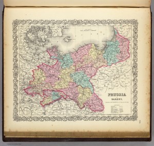
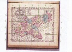
This project took me quite a bit of time and resulted in some light hand cramping and plenty of erasing while working on my free hand map. I think the free hand map was the most challenging, especially when it came to scaling. I chose an 1856 map of Prussia and Saxony from the David Rumsey Collection and started by scaling it up 25%. I printed out a copy of it, drew a grid on top, and then proceeded to copy it onto the graph paper I had. I thought this would be the easy part! I was sorely mistaken.
It was very difficult to say the least. I didn’t have a ruler at home, so I improvised with measuring tape. The actual drawing part required much attention and I messed up frequently, and I still ended up with something that I don’t feel is all that great. This part of the exercise really showed me how precise map makers and cartographers must be and how time consuming their jobs must be. Here’s my hand drawn map in in all its smudgy glory:
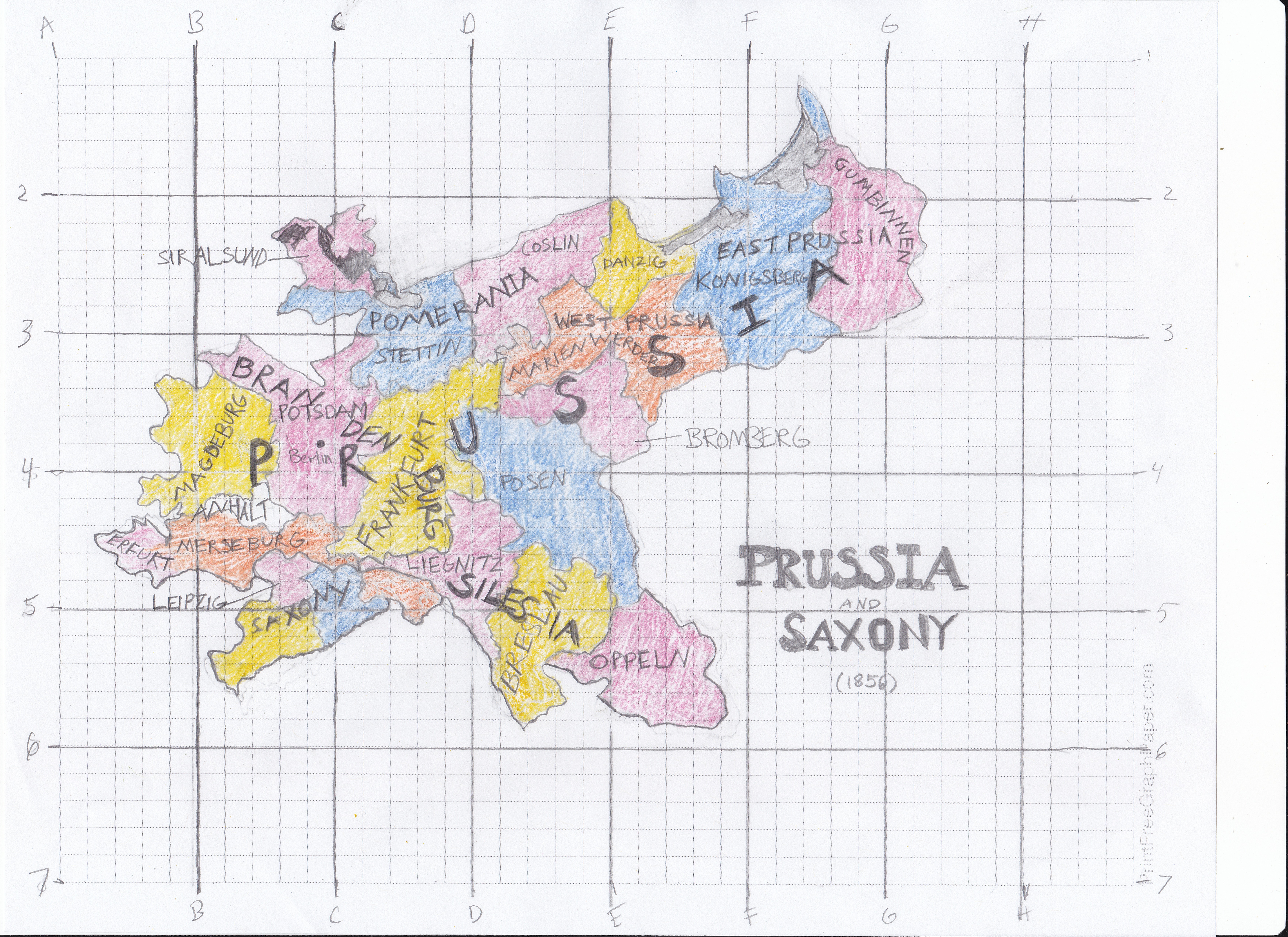
Looking back at this section of the project, I should have attempted something a little less detailed. I also shouldn’t have written place names on the map, as it would cause frustration while tracing the map in Adobe Illustrator, which you can see below:
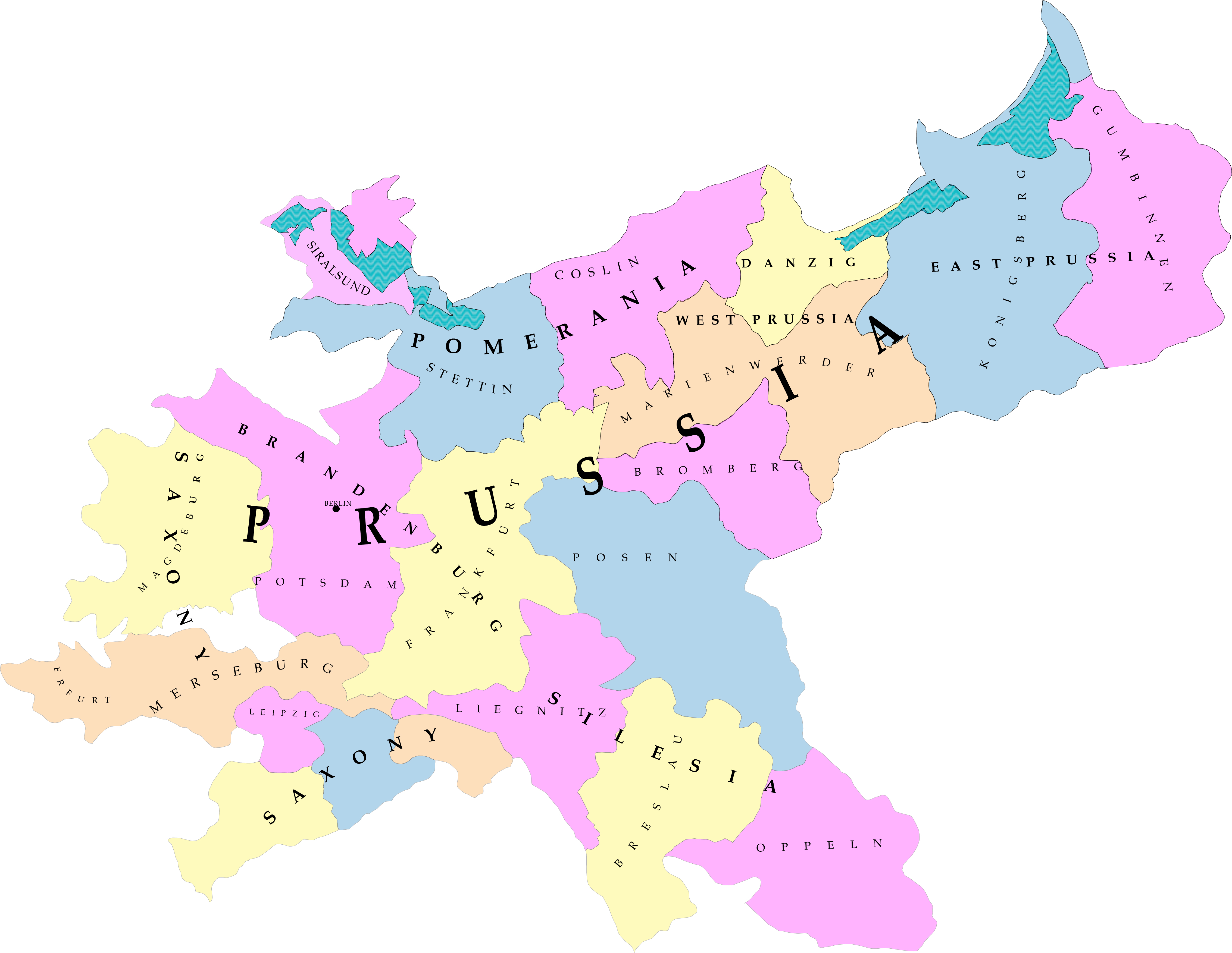
While this digital version looks much better to me with its clean lines, it still leaves out a lot of detail that the original map has. I went ahead and traced the original map in Illustrator to see how that would turn out. Both of these tracings took an enormous amount of time, as there are many states to draw with the pen tool.
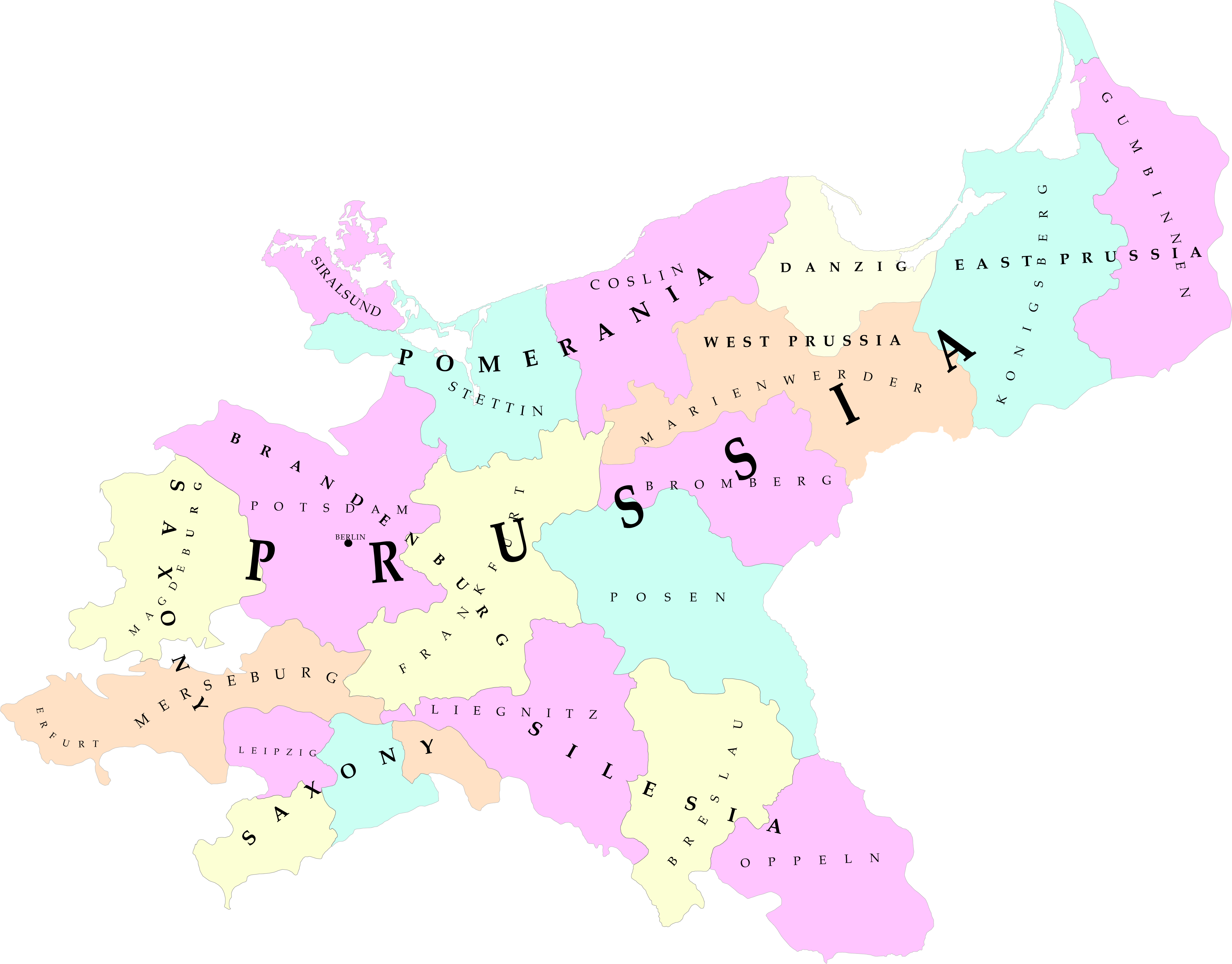
As you can see, the islands and peninsulas in the north are much more distinct here than in my hand drawn version. I did enjoy learning how to use the “type on a path” function, which came in handy for identifying place names. That might have been my favorite part of this project. I tried to emulate the original colors, fonts and type as much as possible.
Overall, I think I learned the importance of space and scale when drawing a map. I became more comfortable using the pen tool as well. I think I can use these techniques in my final project, or in future scholarship as well.
This week I’ve commented on Michael’s and Jefferson’s blogs.
That is so much more complicated than what I attempted. I think the digital version looks incredibly professional. I left the opacity of the “fill” a bit translucent, but having seen how yours turned out with the opacity at 100%, I wish I had done the same. It looks very neat and clean.
I forgot to mention in my post – I actually did change the opacity of the colors! I set them all to 30%, but they ended up turning out more pastel for some reason. After I finished the top layers of outline/color/text, I deleted the bottom layer of original map, which probably just left a white background from the art board. Thanks for the comment!
April,
Your digital rendering looks very professional. I think you could find employment doing this!