Monthly Archives: September 2015

Beer, Maps, and Railroads?

In honor of Drink Beer Day (yes, that’s a real day according to Daysoftheyear.com), I’ve wanted highlight one intriguing feature of the four Sanborn maps I had found a few weeks ago through Penn State’s Digital Collections. I am still focusing on my hometown of Renovo for my final project, but would like to tie in local businesses that were around during the town’s early years.

Luke Binder's biographical entry in the Commemorative Biographical Record of Central Pennsylvania (1898), published by the J.H. Beers Company of Chicago
Luke Binder’s biographical entry in the Commemorative Biographical Record of Central Pennsylvania (1898), published by the J.H. Beers Company of Chicago

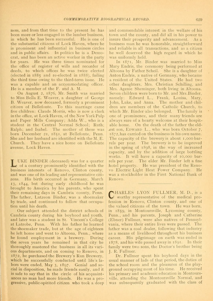
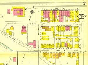
One such local business was Binder’s Brewery, which was owned by the Binder family from 1872 until at least 1911 (still need to find complete history). The original owner of Binder’s Brewery, Luke Binder, had emigrated to the United States from Germany with his parents at the age of 8 and settled in Cambria County. Luke attended St. Vincent College in Latrobe, PA and moved to Altoona where he worked at a brewery and married another German immigrant, Maximilliana (Mary) Endris/Endress in 1871. A year later Binder purchased an already established brewery in Renovo and the couple raised their family, who would continue in the family’s business after Binder died in 1897. The image on the right is a page from the Commemorative Biographical Record of Central Pennsylvaniawhich was published in 1898 by the coincidentally-named publisher, J.H. Beers & Co. This source is the most authoritative one that I have found on Binder, but information found through Findagrave.com has given me further sources to trace on the Binder family. This information about the family is interesting, but I’m not sure how to turn it into a map project about Renovo, unless I map the travels of Binder from Germany to Pennsylvania.

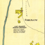
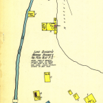
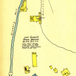
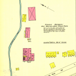
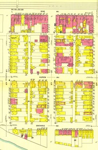
The Sanborn maps above show the changes made to the brewery from 1887 to 1911, including the change in ownership to Mrs. Binder after Luke’s death in 1897 and the change from wood structures to brick. It also shows the geographic location of the brewery, nestled between mountains and a flowing stream, which the brewery used to make their beer. As a kid, our family would often go to Brewery Run to fill up jugs of spring water to drink. I never realized why it was called Brewery Run until recently! I’m not sure if any remains of the brewery are left standing, but I may investigate on my next trip back home. Hopefully I can get more research done on the railroad and other local businesses while I’m there, too.

Ideally, I would like to do a project on the distribution of beer from Binder’s Brewery, but I am not sure where those records could be found, or if they even exist. I plan on reaching out to the Clinton County Historical Society to see if they can help point me in the right direction. I would like to see how far the beer traveled and if the brewery utilized the railroad in any fashion. I suspect that they did, but I need to find out how. The location of the brewery is on the western end of the town and not next to a rail line. Perhaps they loaded up horse-drawn carts with barrels and then loaded the freight onto the train? I am not sure how that worked, but I’ve been looking at some books about the history of beer and brewing to see if I can connect the dots.

I feel like I have a lot of ideas at this point and just need to pull them altogether. Right now, I’m focusing mostly on the connection between the brewery and the railroad within the town, but may have to expand my scope a bit depending on what I can dig up. If anyone has any suggestions, I’m all ears!

A few sources I have looked at so far:

Baron, Stanley Wade. Brewed in America; a History of Beer and Ale in the United States. Technology and Society. New York: Arno Press, 1972.
Commemorative Biographical Record of Central Pennsylvania. Chicago, IL: J. H. Beers & Co., 1898. http://archive.org/details/commemorativebio04jhbe.
Salem, F. W. Beer: Its History and Its Economic Value as a National Beverage. Technology and Society. New York: Arno Press, 1972.

This week I’ve commented on Dale’s blog post on his ideas for his final project on Camp Alger.

Last week I commented on Michael’s blog post about his historical atlas evaluation.

Connecting History & Geography in Print and Online: Evaluating Historical Atlases

This week’s post is my evaluation of historical atlases. I’ve reviewed Derek Hayes’ Historical Atlas of the United States: With Original Maps and the University of Richmond’s Atlas of the Historical Geography of the United States that has been made digital by the university’s Digital Scholarship Lab. Both are examples of how historical atlases can provide geographic and historical information but demonstrate the advantages and disadvantages of print vs. online atlases.

Derek Hayes’ Historical Atlas of the United States: With Original Maps is a substantial collection of maps that chronicle the changing views that cartographers had of what would become the United States from the fifteenth century through today. The collection contains many maps with accompanying essays about the era in which they were produced, as well as descriptive captions that provide some detail about the map shown. Unfortunately for the reader, many of the maps displayed in the book are too small to be deciphered and the text tends to outweigh the visual information at times. The layout of the pages is somewhat perplexing as well. Captions are placed in unintuitive locations that lead to minor confusion when trying to match them with an image. As a whole, the book is informative as it provides an expansive history of the changing look of America geographically and uses maps to demonstrate themes in American history, but its design leaves the reader disappointed by the difficulty of viewing the actual maps.

As I am interested in rail maps, I examined closely the two-page spread, “Steam and Iron Rails,” on pages 178 – 179. Hayes178-179 The background beige color of the spread is actually not as bad as it looks in my poor-quality photos (I didn’t have access to a large format scanner) and allows the imagery to stand out while keeping with the color theme of the maps used. Because page 178 includes three maps, the captioning seemed to be out of order to me and confusing. Initially, I expected the caption to be located closer to the image in question like Hayes has done on other pages. Upon examining it further, I determined that the captions were ordered to mimic the order of the maps, which made more sense to me. This motif is replicated on the following page, although I think the captions could have been placed in a clearer manner. I also think that the size of the lettering in the captions and the main text could have been slightly smaller in order to allow for more space for larger images.

The images on this spread, specifically the first two on page 178, are hard to make sense of. I struggled to comprehend what exactly I was looking at, as the size of the maps prevented me from reading and viewing the maps adequately. Hayes178 The map of Hannibal and St. Joseph Railway and Connections on 179 is much more legible and easier to view, however. There are two extra images in this spread that leave me conflicted. On one hand, it is nice to have additional artwork that relates to the theme of the essay. However, in the context of a historical atlas, where the focus is on maps, I think the space taken up by these images is wasted. Hayes179 As the length of the essay is also overwhelming, more attention to the actual maps would be much appreciated. In a world where I am accustomed to having the ability to zoom in and pan on a digital map, I might just be spoiled by the convenience of the Internet, which may explain my disdain for such small maps. However, the actual number of maps contained in the Historical Atlas of the United States: With Original Maps is rather impressive and undoubtedly required strenuous research.

In comparison, the digitized and enhanced version of the Atlas of the Historical Geography of the United States, created by the Digital Scholarship Lab at the University of Richmond, is an interactive resource that allows for easy navigation and customized viewing options. Staying with my railroad theme, I browsed the table of contents to locate the “Industries and Transportation” section. There I found the collection of maps that I could click through and see either a standard plate view, or an overlay of the plate on top of a map of the United States. This “georectified” view provides a point of reference for the 1932 atlas maps. In the case of the “Pennsylvania System (1914)” map, I can clearly see the rail system’s connections to major cities, as the map has been georeferenced with map coordinates using ArcGIS and warped to adhere to the web-mercator projection. I appreciate the ability to toggle between georectified and plate views, as well as the option to view the textual description of the map in a sidebar. These interactive features make the atlas easier to comprehend and view, as the zoom and pan controls are also included.

As a digital historian, I appreciate the application of technology to help understand historical information. I would love to see Hayes’ Historical Atlas of the United States digitized and made interactive, but acknowledge that it would be quite the undertaking to do so. While some materials I prefer to see in print, such as large loose-leaf maps (such as the Sanborn Insurance maps), having a digital component is immensely helpful in exploring the detail of a map with the convenience of doing so in your home or wherever one can access the Internet. A large print map gives viewers the benefit of a big picture, something that may be lost in translation in the digital realm. I think the incorporation of georeferencing and georectifying, as seen in the University of Richmond’s historical atlas, helps to bridge that gap, however. No matter what the format, historical atlases are extremely useful in connecting geography with history and should be explored more closely.


Extracting Information from Maps

Expanding on last week’s discussion and thinking about a possible final project, I’ve been searching for maps of my hometown, Renovo, PA, to see what kind of information I can glean from them. I was able to find digitized Sanborn maps from 1887, 1892, 1897, and 1911 from Penn State’s Digital Collections and two more from 1904 and 1941 that are cataloged at the Library of Congress. As we saw last week in class, these Sanborn maps contain a ton of information about businesses, homes, and street grids, acting as snapshots in time.

Just by viewing the 1911 map, I can see that there are more businesses along Erie Avenue than any other street, making them visible to the train passengers that passed through or stopped in town. You can also see on sheet 3 the location of the railroad’s footbridge that allowed workers to cross the tracks to reach the repair shops.

 Erie Avenue was the heart of the business district, as stores, grocers, banks, and restaurants catered to the employees of the Philadelphia & Erie Railroad, which later became the Pennsylvania Railroad. Incorporated in 1866, the borough of Renovo (Latin for renew) was established to maintain and repair the trains that traveled from Philadelphia and Erie and subsequently a population grew around the railroad for just over a century until 1968.  By the time that I was born in the early 1980s, the bustling Renovo that once hummed with a large workforce was largely gone.

As the railroad left Renovo, the population dwindled, businesses closed, and many of the buildings along Erie Avenue collapsed or burnt down. The shops that once employed thousands of workers across the tracks were also torn down over time after being re-used for a variety of other purposes.

 As a kid, I never understood why “Back Street, ”which is what we called Erie Avenue, had the majority of businesses that was left in town, when Huron Avenue was the main thoroughfare through the town (PA Route 120). Looking at this 1911 map, though, I see what all the fuss was about. If I were a smart business owner in the early 1900s, I would surely want to have my storefront face towards the direction of the rail yards. It’s interesting that as the rail industry left town, more travelers had already switched to automobiles for their transportation needs. The highway that cuts through town bypasses Erie Avenue altogether.

While the borough of Renovo has said goodbye to the rail industry, a single track that still remains parallels Erie Avenue while all but one of the original repair shops have been erased. Currently, the town is undertaking a revitalization effort to restore the historical value of Renovo and a brand new energy plant is slated to be built in the next few years. As the sesquicentennial anniversary of the town’s incorporation approaches next year, I’m finding its history even more fascinating. I’m hoping I can use maps to uncover some historical aspect of Renovo that may have gone unnoticed and perhaps contribute to the town’s revitalization effort by highlighting its rich industrial history. 


This week, I’ve commented on Danielle’s blog about tackling research questions and arguments.

How Historians Can Use Maps

I’ve always considered maps to be useful resources no matter what historical period I happen to be studying at any given time. I like being able to place events because doing so provides me with another perspective. Focusing on the “where” of an event, along with the “who” and “what,” contributes to my understanding of it. Maps can tell us how close the nearest river was, what cities were close by, and other factual details that a visual representation of a geographic space can. As historians, we try to include more information, such as the “how” and “why” of events. These attributes aren’t usually found in a standard geographical map. By considering the context of the map, we can start filling in these holes.

Think about an old railroad map that marks the stops of a particular line. One inference from looking at the map is that the cities were most likely chosen because of their population, as railroad companies wanted to sell tickets where people would buy them. However, looking at historical data is necessary to test this theory, as well as other sources. This might be a good use of GIS, which could pull in historical census data to create a new map. A time-lapse map could even be created to reflect how those train stations changed over time, as well as the local population. This is just one facet of how maps can aid historians in “doing history.”

While I’m still absorbing the readings from this week, I am looking forward to creating our own maps in class. With such an abundance of maps everywhere we turn (Google maps, Metro maps, campus maps, etc.), I think historians can benefit from employing more maps in their research. In the past, I’ve usually been drawn to maps for their artistic qualities, but now I am starting to realize the power that maps hold. Who decides what gets put on a map vs. what doesn’t? Throughout history (mostly after 1500) maps have been created for a wide range of uses. From identifying land ownership to public transportation, maps have been a source of understanding space and time. The information we can get from maps can only improve our scholarship.
ETA: This week I’ve commented on Erin’s blog post on early maps.