This week in class, we looked at a few different data visualization tools, such as RAW and Palladio. After class I attempted to try out the tools on my own, which was kind of fun. I like being able to visualize information in a non-textual format, especially when you can use fun colors like RAW allows you.
Using a dataset provided by Dr. Robertson that connects Civil War units with corresponding battles, I created a visualization with the Alluvial Diagram option. RAW allows you to customize the size and color, which I did by enlarging the height (1500px) and width (500px), and changing the colors to ones I thought looked good to me, but were also distinct, as you can see below.
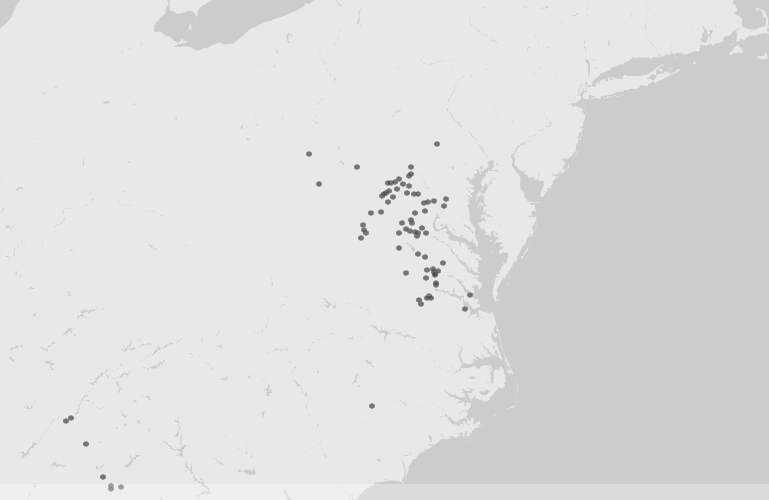
I used the same dataset as above with Palladio, which offers visualization options such as maps, graphs, lists, and galleries. I had some trouble trying to extend the Battles to include their location coordinates, but after reading the FAQ I realized that I needed to identify the new data as “place, coordinates” for it to display properly. I was able to create a moveable graph with the nodes (the units) connecting to the battles, and with the location coordinates I was able to see the battles displayed on a map. Unfortunately there are no embedding options that allow for interactivity, so I’ve taken a screenshot of the map. On the live version, you can click on on hover over each dot to reveal the name of the specific battle.
Palladio screenshot, map view
After playing around with RAW and Palladio, I took a shot at Gephi, which requires a download and installation. Even after re-reading Elena Friot’s tips and personal experience with Gephi, I still didn’t quite grasp its usefulness. I added the data in as described, but all I got were a cluster of dots that I didn’t know what to do with. I much prefer the more user-friendly interfaces of RAW and Palladio, and I’m trying to think of ways to use them in my own research. I could try creating a dataset from the Henry Schweigert diaries that link the diary entries by date to locations in which they were written, or what subjects are mentioned in them, in order to gain a different perspective of the overall patterns in the diaries.
This week’s readings on networks started off a bit confusing to me, but by the time I ended up at Weingart’s Networks Demystified series, I felt like I had learned the ins and outs of networks, more or less. I had never given much thought to the visualization of networks, nor how historians, humanists, or social scientists have been using them before, which may have explained my bewilderment with some of the week’s articles. I’ve come to understand that networks are basically connections between things, usually people. However, there can be many factors that play a part in these networks that we as historians should try to take into account.
One example, cited by several of this week’s authors, is John Snow’s cholera map showing how the 1854 outbreak began in London. John Theibault writes that Snow’s map presented a narrative, as well as analysis of the epidemic, and leaves it at that. Meanwhile, Johanna Drucker takes Snow’s map a bit further, putting into question just who all those dots were socially and demographically, as well as providing us first with a street map with plotted dots, and an updated version of the map that replaces the dots with actual humans. The human figures on the map help illustrate that each dot from Snow’s map represents a single individual, reminding us that there is more information than meets the eye in all data.
What has helped me understand the purpose of visualizing networks were Klein’s article on archival silence and data visualization in regard to Thomas Jefferson’s communication with James Hemings, who was Jefferson’s slave and chef, and the Mapping the Republic of Letters project, in particular the case study of Benjamin Franklin. Both utilize correspondence data to show patterns of communication. In Jefferson’s case, although he did not directly communicate with Hemings, the digital version of the Papers of Thomas Jefferson contains an editorial note about Hemings, as he was mentioned in his letters to other people. From this, the author was able to chart the frequency Hemings was mentioned and also in which correspondence he was referred to. This visual aid helps to show us how Jefferson communicated about Hemings, which would not be known if only relying on letters written directly to him, which were none.
More general patterns can be seen in Franklin’s letters, such as which country he was receiving letters from most during a particular time frame, what kinds of people he was corresponding with (professionals, artisans, etc), and his top correspondents. This approach helps answer questions about Franklin’s correspondence that might take large chunk of time to extrapolate, which is one of the benefits of visualizing networks.