Monthly Archives: October 2015

Photoshopping the Shops on Erie Ave

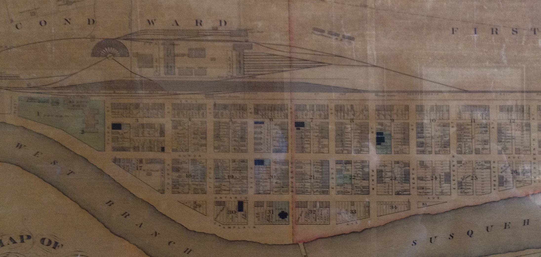
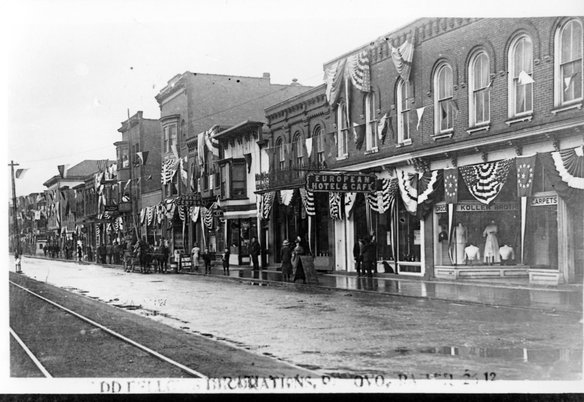
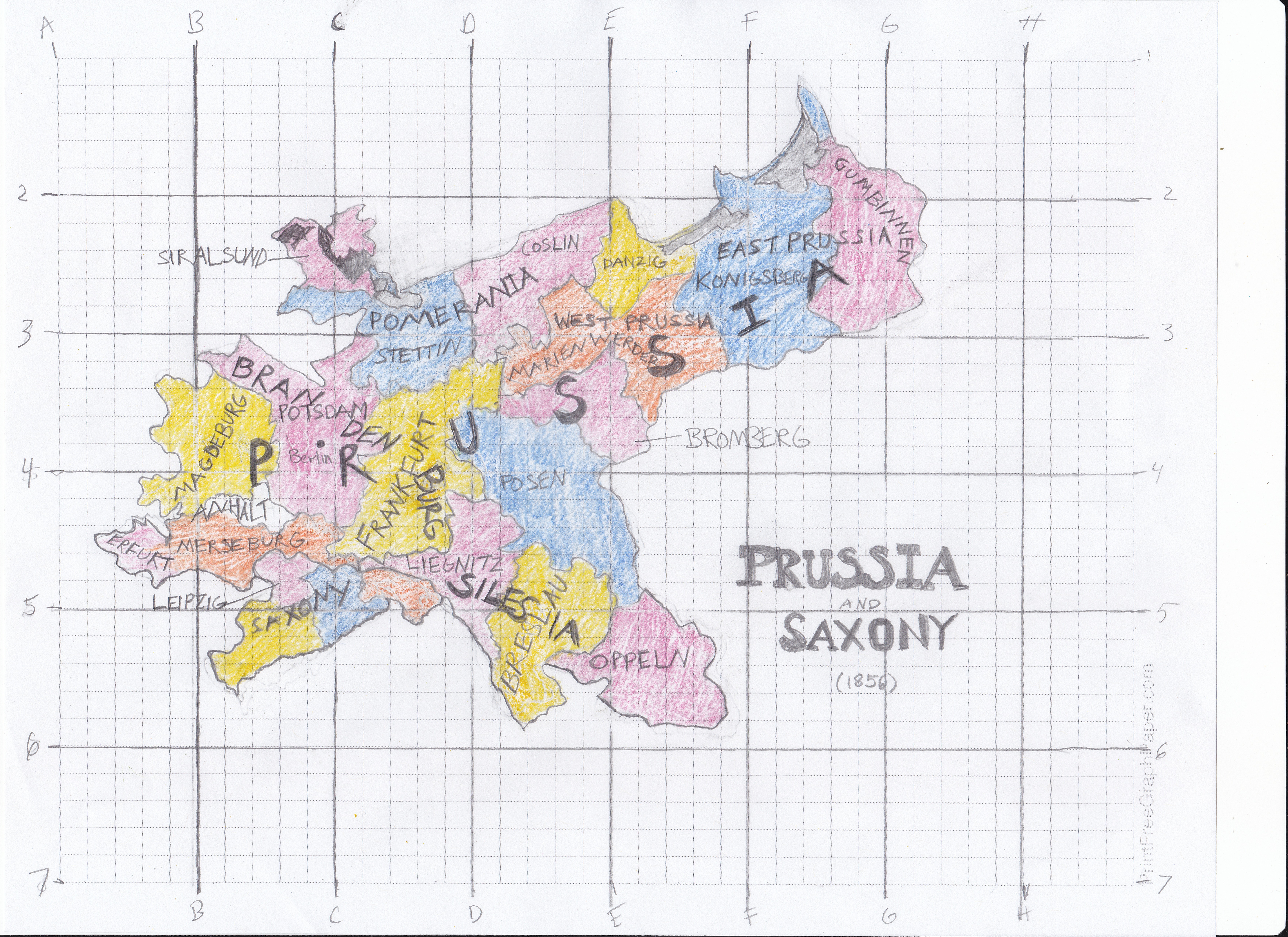
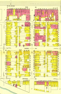
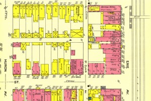
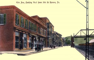
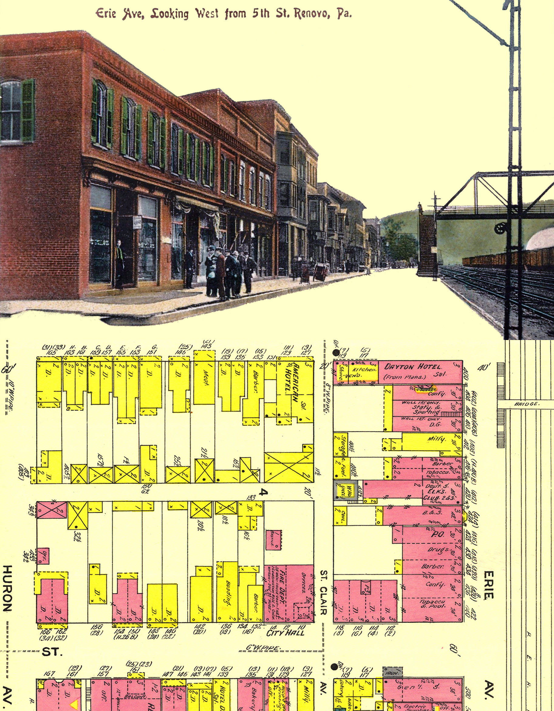
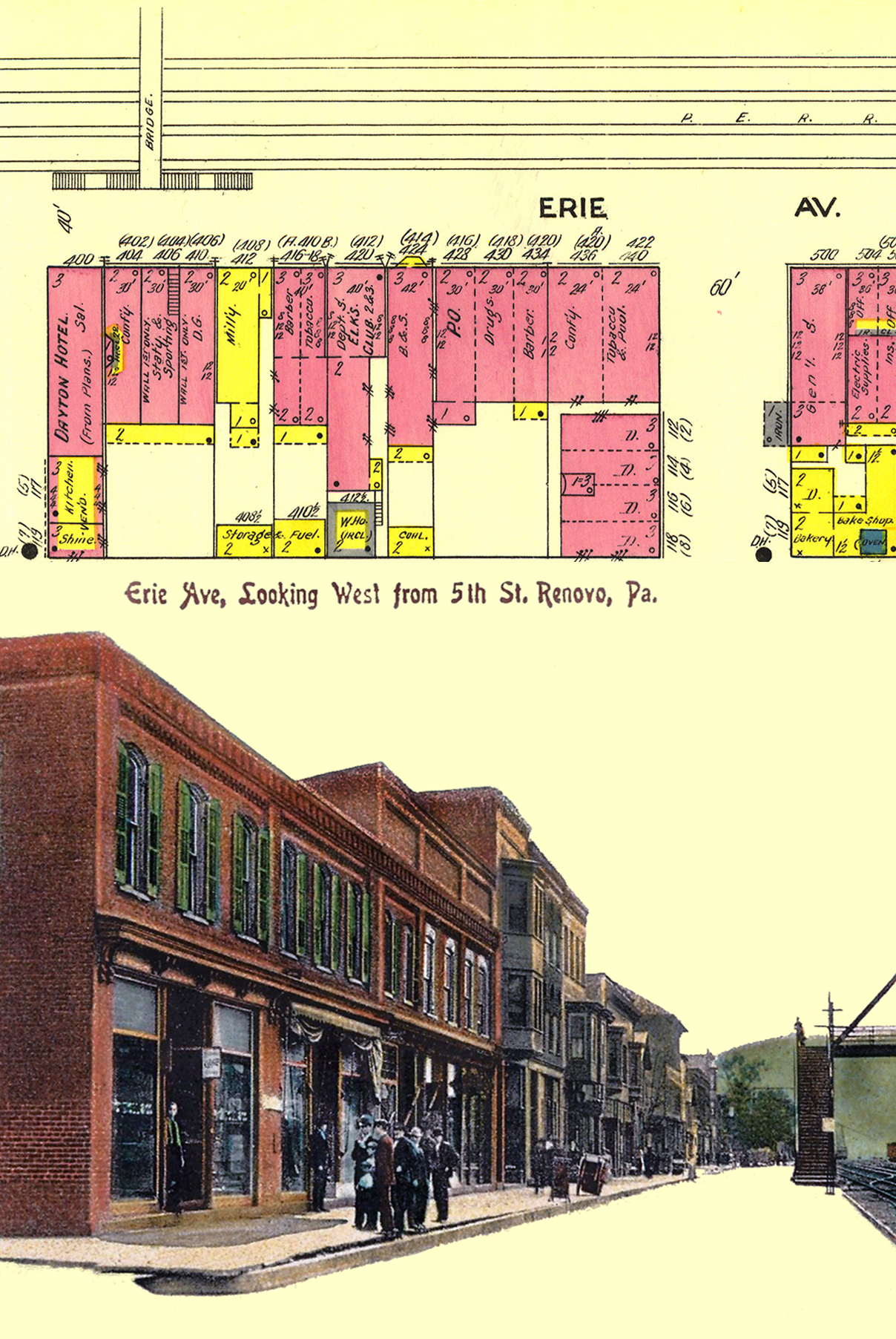
For this assignment, I played around in Photoshop with two images I may use in my final assignment. One is the Sanborn map of Renovo, PA from 1911 and the other is a postcard dated from 1908 of the bustling street scene on Erie Ave that I found on eBay. The postcard was a bit tricky to work with since it wasn’t a typical photograph, but rather a type of lithograph that added color to the original photo. I thought its focus on the street scene parallel to the railroad tracks would be a good visual representation of what the 1911 insurance map had depicted. Both the map and postcard include the footbridge over the rail yard, which I thought was a good landmark to feature since it was an access point between the town’s business district and the railroad shops for the the railroad workers.

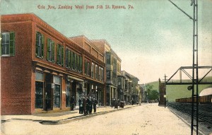
I also thought it was interesting to see how the the Sanborn map can help identify what the buildings in the photographs were. For example: The first shop on the corner of 5th and Erie has a man standing outside the store who may be a customer exiting, or he could be an employee or owner of the shop. From the Sanborn map, that same building is labeled as “Tobacco & Pool” and if I look close enough, I can almost imagine that the sign outside says “cigars” but the resolution isn’t clear enough to be totally sure, even after my Photoshopping attempts. I’ve since purchased the postcard from eBay so maybe when I see it in print I will be able to decipher the sign.

Working in Photoshop, I took the original postcard image and changed the image size to approx. 4×6 inches and set the resolution to 300, thereby enlarging it. I tried various filters, such as “despeckle” to help smooth out the graininess of the picture. I also did some clean up work on the image with the “spot healing tool” to remove blemishes, and the “patch tool” to fix the discoloration the right hand edge of the card. I adjusted the curves a bit and used the “dodge” and “burn” tools to see how they could alter the image. The burn tool made the edges of the building a little darker and the dodge tool made the shop windows a little more lighter.

The changes to the Sanborn map were not as complicated. I cropped a 4×6″ section out of the original, making sure to capture the Erie Ave shops and footbridge that are featured in the postcard. I also downsized the resolution to 300 dpi. Then I decided to rotate it 90 degrees clockwise to have the streets mimic the orientation of the postcard. After that, I wasn’t sure what to do next. I didn’t want to tint the image (or the map) because every time I did, I just didn’t like what I saw.

Then I thought about replacing the sky and street with the beige color of the Sanborn map to reflect a common color. I used the “magic wand” to select large sections of the sky and remove them from the image, then touched up what was left with the eraser. Then I added a new layer below the postcard and filled it in with the “Sanborn Beige” color I had sampled from the map. It looked a little odd with the street and sky being replaced with the beige, like the shops were just floating in space. So I thought I could connect the two images by enlarging the canvas to place both images together in one image. I’m still not sure this is the best I could do, but it was better than having the two images separated. Combining them also helps draw the viewer to the map to try to identify the shops. I tried two different orientations of the 1911 map to see how they would both look with the postcard, and I’m not sure which one is better (or worse). I think the one with the cropped map on top is less busy and easier to view, though. However, I had to crop some of postcard scene out and play with the sizing more to get it to fit. I liked this assignment because it helped me practice my Photoshop skills that have gotten rusty, even if I’m not 100% satisfied with the results.

After Photoshop, 1911 map on bottom, postcard on top
After Photoshop, 1911 map on top, postcard on bottom


This week, I’ve commented on Jefferson’s digitally enhanced images on his blog.


Behind on Blogging

I’ve gotten way behind in my blogging this week, so I think I’ll just point out some of my classmates’ posts that I found especially interesting and have commented on.

Danielle’s final project idea about using zip codes has the potential to turn out pretty interesting, as zip codes are basically geographic codes for the postal service to use. However, she has also found other uses for zip codes that have used demographic information to create different types of maps.

Erin’s recent post on comparing the Game of Thrones’ map of Westeros with the map of the U.S. made me realize just how huge the fictional setting really is. He includes a map that places the two regions side by side for comparison, which is pretty interesting to see.

I related to Josh’s post on mapping sounds as he wrote about the difference between noises heard in rural Pennsylvania compared to the sounds of the DC metro area. Growing up in a similar location that’s fairly quiet in its surrounding woods and mountains, I can see the value in mapping geographic areas by the noises and sounds they emit.


Research on My Final Project

This past weekend I went back to my hometown of Renovo, PA and was able to find some information that should help with my final project. On Saturday, I got the chance to visit the Greater Renovo Area Heritage Park Association’s headquarters at 530 Erie Avenue.  The association has recently restored the building and now houses historical artifacts, photographs, and a map from 1882 that I tried to get a photograph of. I spoke with a few members of the association about my project and they were very interested and suggested another project about the CCC camps in the area that they think I might be able to help out with as well. A friend of mine also had some historical photos of the town and my mom had several books for me to consult. It was very productive!

1882 Map of Renovo with railyard

So far, in my head, my project will focus on what Renovo looked like geographically over the past 150 years, as next year the town will celebrate its sesquicentennial. Prior to being incorporated as a borough, the Renovo area was a hunting area for native Americans. I’d like to include a map of the Sinnemahoning Path, which crossed through Renovo and follows the West Branch of the Susquehanna River and PA Route 120, to highlight how this path is still being used today. I also want to see how the old railroad lines matched up with this path and see how they compare to the old travel routes.

View of Erie Ave in 1910s

Another part of my project will hopefully utilize some of the software we’ve been learning or will learn, such as Natural Scene Designer and SketchUp. I’d like one section of the project to focus on Erie Avenue and the railroad by reconstructing what the area looked like in the early 1900s (1900 – 1915). I’ve been collecting images of Erie Avenue from this time period to help provide me with the details I’ll need for reconstructing. I plan on using the 1911 Sanborn map and making it look 3D with SketchUp. I’d also like to try a line of sight image of what Erie Avenue would have looked like as one exited a train at the passenger station at the end of the street in 1911. I also would like to feature Binder’s Brewery into my project by using the old Sanborn maps to show its transformation over the years. The brewery was located to the west of Renovo but still within the town limits. I’m thinking about including a modern day view of the town to compare/contrast the geography of Renovo with its historical counterpart, but I may be taking on too much. I think I can do it, though, I just need to plan. Right now I have my finished product all inside my head and need to transfer it to my sketch pad to see how it will turn out on paper.

Free Hand and Digital Map Project

This project took me quite a bit of time and resulted in some light hand cramping and plenty of erasing while working on my free hand map. I think the free hand map was the most challenging, especially when it came to scaling. I chose an 1856 map of Prussia and Saxony from the David Rumsey Collection and started by scaling it up 25%. I printed out a copy of it, drew a grid on top, and then proceeded to copy it onto the graph paper I had. I thought this would be the easy part! I was sorely mistaken.

It was very difficult to say the least. I didn’t have a ruler at home, so I improvised with measuring tape. The actual drawing part required much attention and I messed up frequently, and I still ended up with something that I don’t feel is all that great. This part of the exercise really showed me how precise map makers and cartographers must be and how time consuming their jobs must be. Here’s my hand drawn map in in all its smudgy glory:

My hand drawn map of 1856 Map of Prussia

Looking back at this section of the project, I should have attempted something a little less detailed. I also shouldn’t have written place names on the map, as it would cause frustration while tracing the map in Adobe Illustrator, which you can see below:

Digital tracing of 1856 Map of Prussia
Digital tracing of hand drawn version of 1856 Map of Prussia

While this digital version looks much better to me with its clean lines, it still leaves out a lot of detail that the original map has. I went ahead and traced the original map in Illustrator to see how that would turn out. Both of these tracings took an enormous amount of time, as there are many states to draw with the pen tool.

digital tracing of the original 1856 Map of Prussia

As you can see, the islands and peninsulas in the north are much more distinct here than in my hand drawn version. I did enjoy learning how to use the “type on a path” function, which came in handy for identifying place names. That might have been my favorite part of this project. I tried to emulate the original colors, fonts and type as much as possible.

Overall, I think I learned the importance of space and scale when drawing a map. I became more comfortable using the pen tool as well. I think I can use these techniques in my final project, or in future scholarship as well.


This week I’ve commented on Michael’s and Jefferson’s blogs.