This week’s post is my evaluation of historical atlases. I’ve reviewed Derek Hayes’ Historical Atlas of the United States: With Original Maps and the University of Richmond’s Atlas of the Historical Geography of the United States that has been made digital by the university’s Digital Scholarship Lab. Both are examples of how historical atlases can provide geographic and historical information but demonstrate the advantages and disadvantages of print vs. online atlases.
Derek Hayes’ Historical Atlas of the United States: With Original Maps is a substantial collection of maps that chronicle the changing views that cartographers had of what would become the United States from the fifteenth century through today. The collection contains many maps with accompanying essays about the era in which they were produced, as well as descriptive captions that provide some detail about the map shown. Unfortunately for the reader, many of the maps displayed in the book are too small to be deciphered and the text tends to outweigh the visual information at times. The layout of the pages is somewhat perplexing as well. Captions are placed in unintuitive locations that lead to minor confusion when trying to match them with an image. As a whole, the book is informative as it provides an expansive history of the changing look of America geographically and uses maps to demonstrate themes in American history, but its design leaves the reader disappointed by the difficulty of viewing the actual maps.
As I am interested in rail maps, I examined closely the two-page spread, “Steam and Iron Rails,” on pages 178 – 179. 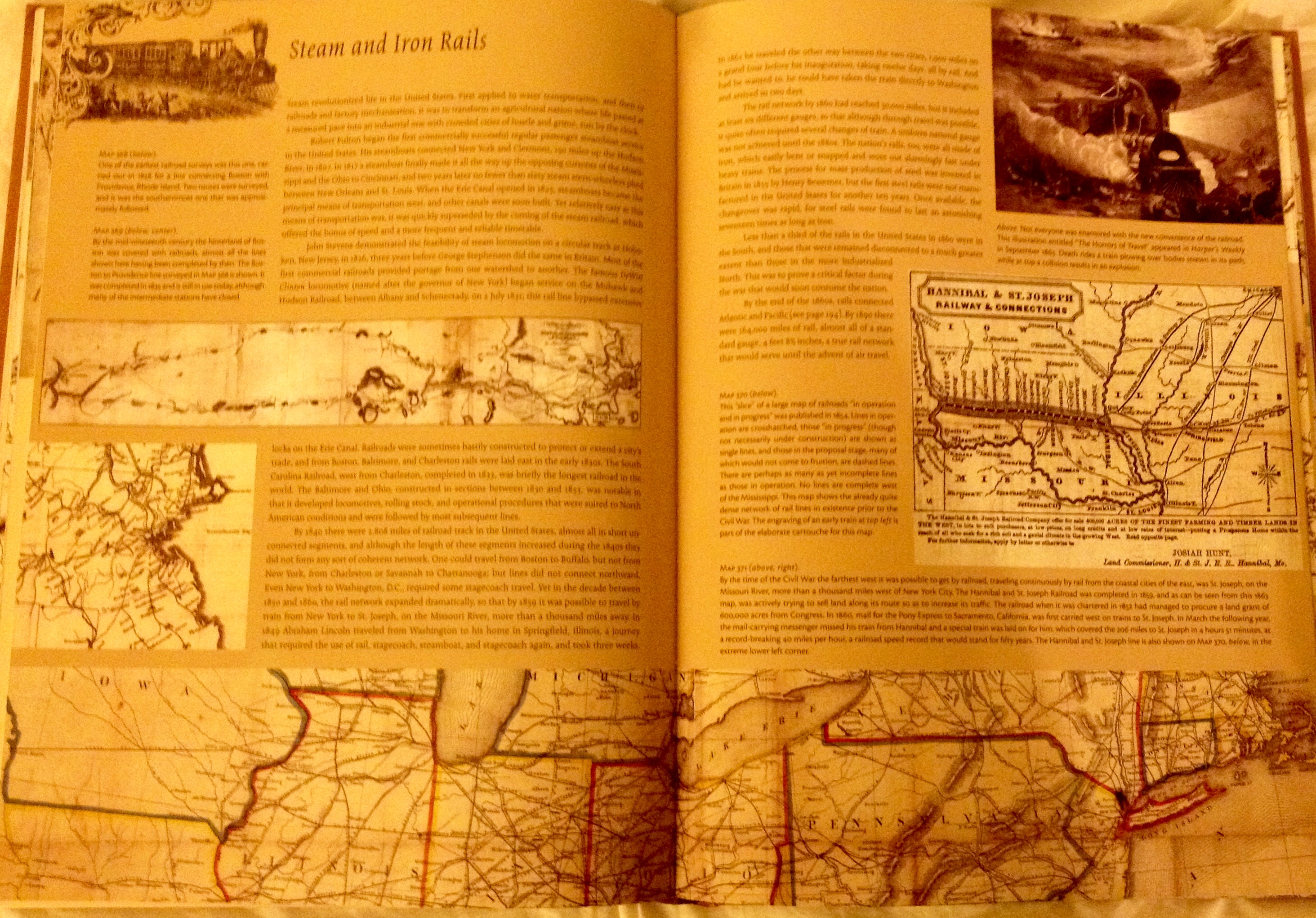 The background beige color of the spread is actually not as bad as it looks in my poor-quality photos (I didn’t have access to a large format scanner) and allows the imagery to stand out while keeping with the color theme of the maps used. Because page 178 includes three maps, the captioning seemed to be out of order to me and confusing. Initially, I expected the caption to be located closer to the image in question like Hayes has done on other pages. Upon examining it further, I determined that the captions were ordered to mimic the order of the maps, which made more sense to me. This motif is replicated on the following page, although I think the captions could have been placed in a clearer manner. I also think that the size of the lettering in the captions and the main text could have been slightly smaller in order to allow for more space for larger images.
The images on this spread, specifically the first two on page 178, are hard to make sense of. I struggled to comprehend what exactly I was looking at, as the size of the maps prevented me from reading and viewing the maps adequately. 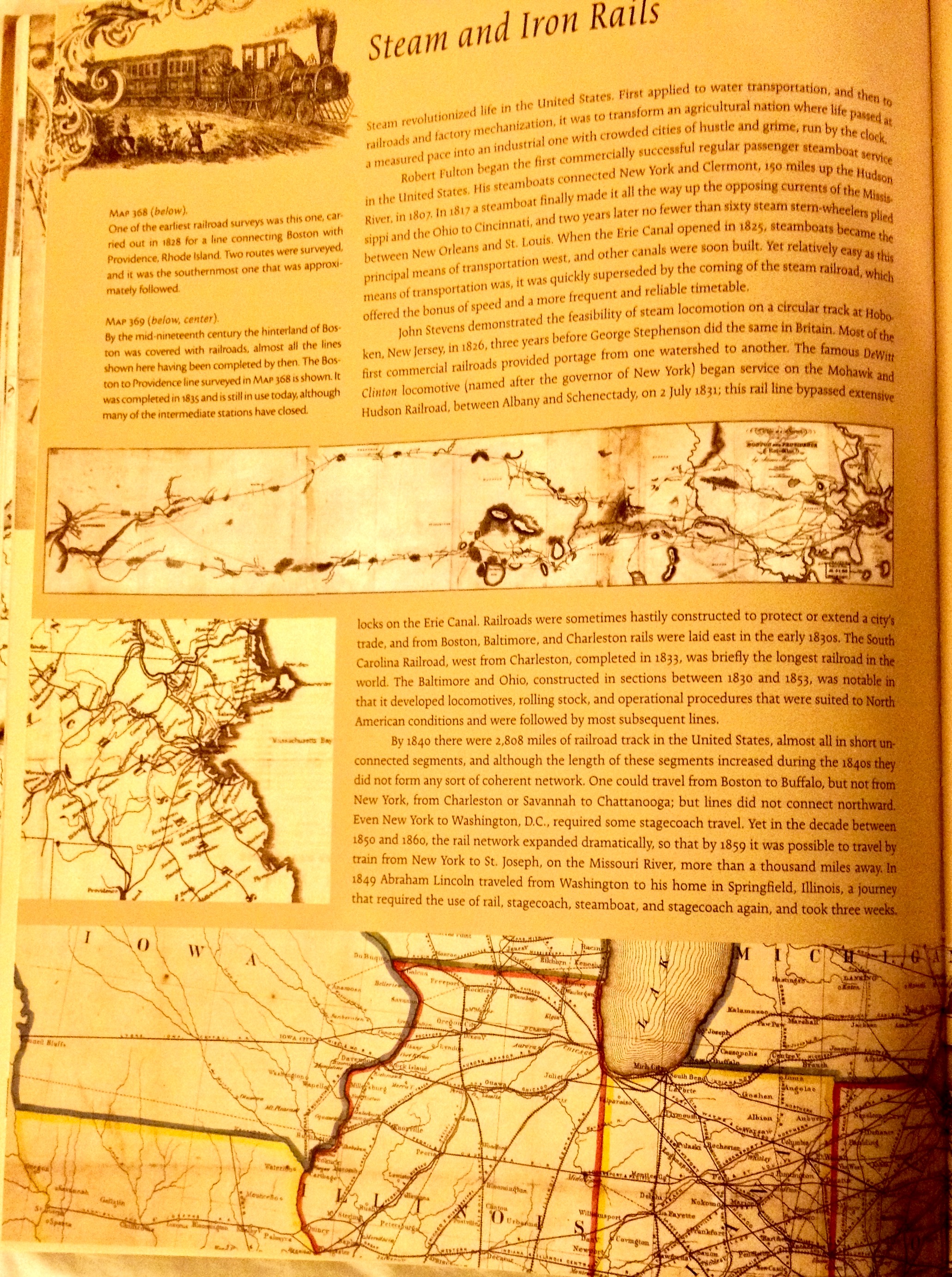 The map of Hannibal and St. Joseph Railway and Connections on 179 is much more legible and easier to view, however. There are two extra images in this spread that leave me conflicted. On one hand, it is nice to have additional artwork that relates to the theme of the essay. However, in the context of a historical atlas, where the focus is on maps, I think the space taken up by these images is wasted.
 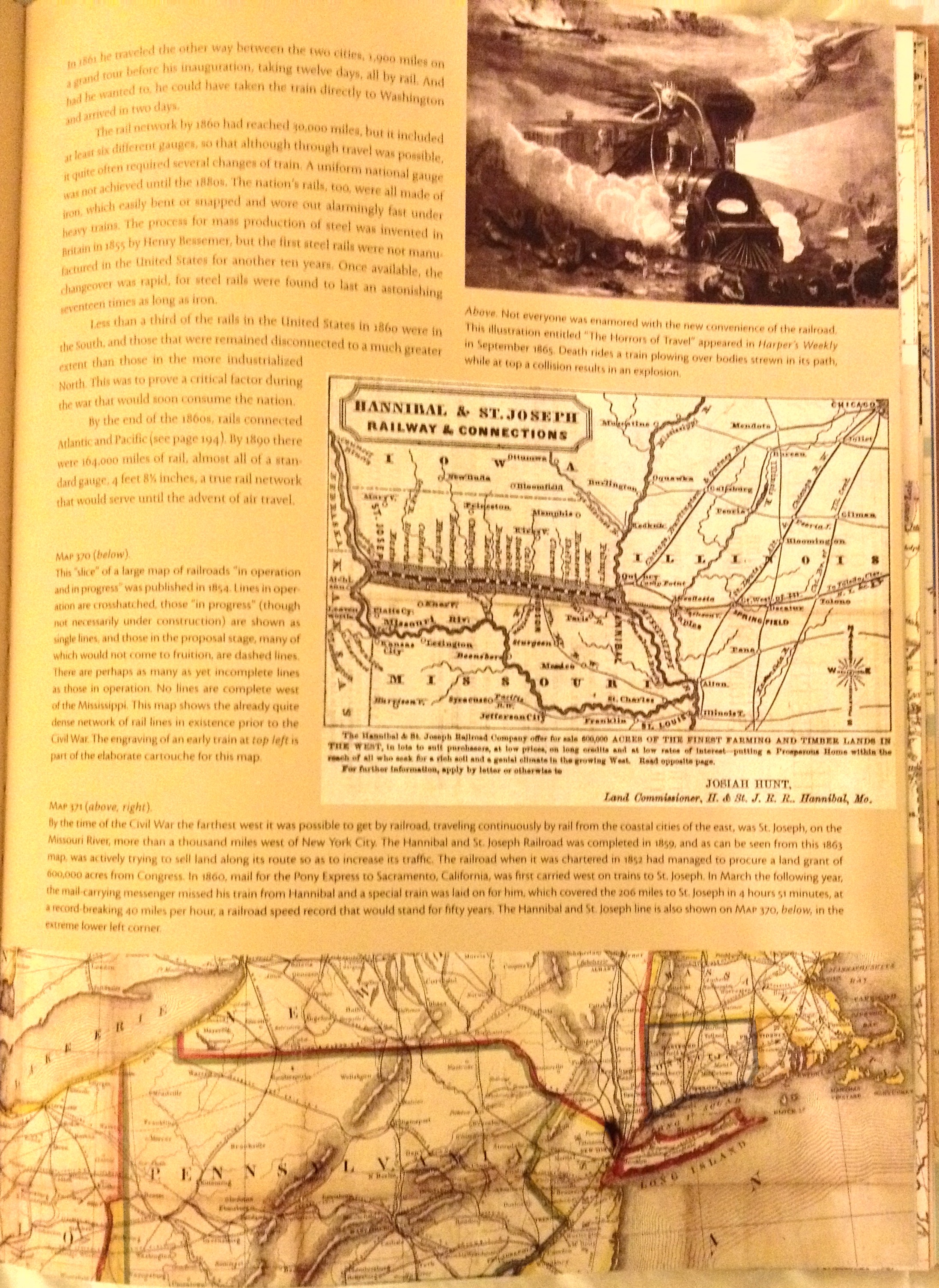 As the length of the essay is also overwhelming, more attention to the actual maps would be much appreciated. In a world where I am accustomed to having the ability to zoom in and pan on a digital map, I might just be spoiled by the convenience of the Internet, which may explain my disdain for such small maps. However, the actual number of maps contained in the Historical Atlas of the United States: With Original Maps is rather impressive and undoubtedly required strenuous research.
In comparison, the digitized and enhanced version of the Atlas of the Historical Geography of the United States, created by the Digital Scholarship Lab at the University of Richmond, is an interactive resource that allows for easy navigation and customized viewing options. Staying with my railroad theme, I browsed the table of contents to locate the “Industries and Transportation” section. There I found the collection of maps that I could click through and see either a standard plate view, or an overlay of the plate on top of a map of the United States. This “georectified” view provides a point of reference for the 1932 atlas maps. In the case of the “Pennsylvania System (1914)” map, I can clearly see the rail system’s connections to major cities, as the map has been georeferenced with map coordinates using ArcGIS and warped to adhere to the web-mercator projection. I appreciate the ability to toggle between georectified and plate views, as well as the option to view the textual description of the map in a sidebar. These interactive features make the atlas easier to comprehend and view, as the zoom and pan controls are also included.
As a digital historian, I appreciate the application of technology to help understand historical information. I would love to see Hayes’ Historical Atlas of the United States digitized and made interactive, but acknowledge that it would be quite the undertaking to do so. While some materials I prefer to see in print, such as large loose-leaf maps (such as the Sanborn Insurance maps), having a digital component is immensely helpful in exploring the detail of a map with the convenience of doing so in your home or wherever one can access the Internet. A large print map gives viewers the benefit of a big picture, something that may be lost in translation in the digital realm. I think the incorporation of georeferencing and georectifying, as seen in the University of Richmond’s historical atlas, helps to bridge that gap, however. No matter what the format, historical atlases are extremely useful in connecting geography with history and should be explored more closely.