Monthly Archives: October 2014

Crowdsourcing History, the Good and the Bad

This week, we are taking a look at crowdsourcing and how it can help and also hinder how history is used on the web. The idea of crowdsourcing in history isn’t  new, as many genealogists and volunteers have been helping archives for quite some time. However, the transition to the Internet has opened up more avenues for crowdsourcing than was previously available. As the walls between professionals and amateurs become less noticeable, it’s important to think about how crowdsourcing can open up new methods of collecting and distributing information without historians having to play the role of gatekeeper.

Prior to this week’s readings, my frame of reference for Wikipedia was from a library science standpoint, which encourages anyone who wants to cite Wikipedia to try to investigate the references from the article. However, a few authors brought up the issue of the gender-divide when looking at Wikipedia, which is something I had not considered previously. While Wikipedia is known for its factual writing that prohibits any original research or bias, that anyone in the world can contribute to, I had not realized that most articles were written by men. Both Rosenzweig and Madsen-Brooks each acknowledge that the average Wikipedia editor is  English speaking and male, which has shaped the types of articles that get attention by editors. This raises questions about what voices are being heard on Wikipedia and how diverse these voices are. Is it really crowdsourcing if only one segment of the population is contributing? There are other issues surrounding Wikipedia, such as the editing wars and incorrect information, that cloud its effectiveness in being a global online crowdsourced encyclopedia, but the issue about gender was the one that struck me as the most intriguing.

Other crowdsourcing projects, like the September 11 Digital Archive and the Hurricane Digital Memory Bank serve to collect personal testimonies about an event from those who experienced it. These projects reminded me of traditional oral history projects, but captured online. The issue of creating a functioning website that allows for easy submission by the user appears to be the biggest hurdle after getting the funding necessary to take on such a project. Projects like these are great in collecting the stories, images, and information that might not survive due to the impermanent nature of the Internet. The staff necessary to make these projects cannot be overlooked as well, as they are not so much playing the gatekeeper in these online archives, but are more like the construction crew. In a project like Transcribe Bentham, the majority of funding was spent on staff, as the project relied on the public to transcribe the manuscripts. In this case, although volunteers were used in the transcription process, the project’s moderators had to ensure quality, as they were going to be ultimately published in the Collected Works edition. While anyone could assist with the project, the staff still retained editing control in the final version, which makes this project an interested experiment. I have been seeing more of these kinds of crowdsourcing transcription projects (probably because I like transcribing) and have even signed up to be a Smithsonian Digital Volunteer to try to do my part.  Although, I should add that I have not had time yet to take on any projects yet as a volunteer.

The issue of crowdsourcing naturally goes against the professional historian grain, especially when we start to think of ourselves as gatekeepers. However, there are benefits to be had, especially in projects that require time and effort that dedicated staff just cannot feasible do in a short period of time. Collecting and capturing original source material is one of the better uses of crowdsourcing history, as it provides another way for archives and digital projects to gather information that might have otherwise been lost.
 

Trying out Omeka

Once I was able to finally get Omeka installed on my website, the program proved quite easy to use, which was great! I decided to use image files from the photo album of Henry W. Schweigert, which is an example of the earlier styles of photo albums that were used to contain cartes-de-visite. The album dates back to the 1870s, and I had scanned all 50 pages of it during the summer but have not been able to put them online yet, as part of my Henry Schweigert Diary project. I thought Omeka might be a good option to try out for this, and so far I think it is proving to be easy to work with.

The trickiest part about using Omeka was creating consistent metadata for my items. I had to go back and forth between the items I had already created and the one I was currently editing, to make sure I was using the same vocabulary. I created a collection for the photo album and then placed all of the items into that collection as I added them. I changed the theme from “Thanks, Roy” to “Berlin” and also installed a plug in called “Item Order” so that I could arrange the items in a specific order. In this case, I wanted to resemble the page order of the photo album. However, when you are viewing the Schweigert Family Photo Album collection page, you can only see the first five items, even though there are six. I tried adjusting all the possible settings to reveal all, but I’m thinking this page just might be a preview page, and I will need to do some research on fixing this, if at all possible. You can see all six items if you select “Browse Items” but they are not in the correct order.

I’m excited to keep learning more about how to customize my Omeka installation, as there are lots of plug ins that I am eager to explore. Besides the trouble that I originally had installing it on my own server space, I think Omeka is a worthy tool of presenting historical collections online. Had I originally used Reclaim for my hosting, I wouldn’t have had such difficulty. Eventually my tech support people were able to fix the problem, which I am grateful for.

Here’s the direct link to my Omeka project.

Public History on the Web

The confluence of public history and technology has enabled the average person to explore historical topics without ever leaving their home. Over the past two decades, the growth of websites dedicated to public history, including museums, historical sites, archives and libraries has been countered with a decline in actual in-person visits. The idea of the museum as a place is something that I have questioned before. Does a visit to the physical museum trump a visit to a virtual one? Or is it the other way around? I see benefits in both types of visits, especially if done well.

When Smith asked if serious history could be done on the web back in 1998, the web looked much different than it does today. Besides benefitting from cleaner and more sophisticated web design, today’s historical websites offer more interactivity than previously available, as evidenced by the evolution of the Great Chicago Fire website produced by the Chicago History Museum and Northwestern University. Although it maintains its core features of images, texts, and essays, the site today is visually different and more user-friendly than the original version.

The ability to create an exhibit online, such as the Great Chicago Fire, allows historians to bypass the traditional route of relying on a physical space. While this makes accessing more original documents and images that one probably wouldn’t encounter in a traditional museum exhibit, the experience of visiting a museum in person is lost. Although virtual tours are common, as described in Anne Lindsay’s #VirtualTourist article, there is something about the museum experience that cannot be replaced fully online. But does this matter?

In a way, the online museum is much more “public” than traditional public history institutions. By increasing access to those who cannot visit in person, allowing educators to bring museums into the classroom,  allowing users to help organize the National Library of Australia online, and putting a city’s history into the palm of one’s hand through a mobile application, the democratization of history can easily been seen. I think serious history can be done on the web, it just looks different than what traditionally has been done in the past. By combining the physical museum experience with the digital one, there is a greater potential of creating more dynamic and interactive examples of public history. In another twenty years public history on the web will probably be even more seamless, especially as we become more accustomed to accessing everything, including history, online.

Mapping the Civil War

For this week’s practicum, I created a map using Google Map Engine, which allows users to plot events in specific geographic locations. In this example, the class used data from the 1st Regiment of the Michigan Calvary from 1864 – 1865.

Google Map Engine’s option to include different icons to label the locations helps to identify the various action that the regiment encountered during the Civil War. The list of battles and campaigns have been labeled with explosion-like symbols, which are most common in this map. The map itself reveals the pattern of movement in clusters of icons, but it doesn’t provide the order of events or other details. By clicking on each marked location on the map users can read more details, such as the specific dates. The ability to use layers allows users to separate events visually, however, I did not choose to use layers in this example. Looking back, I could have had different layers for battles, expeditions, and other different types of events. Or I could have made a layer each for 1864 to 1865. I tried creating layers after the events were created, but it wasn’t obvious as to how to place events on different layers, which is something I will need to look into.
The map is interesting to look at, though, if you think about how far this calvary traveled in two years. At the end of their enlistment, they were as far west as Utah.

Mapping History

From this week’s readings, it appears that there has been some disconnect between historians and geographers in the past. However, there has been an effort made by digital historians recently who have gravitated towards geographic information systems (GIS) to link the two fields together for scholarly purposes. Tim Hitchcock suggests that this division was partially due to geographers’ seeking more secure academic funding by aligning themselves with STEM departments rather than with history/humanities and as a result, there has been little dialogue between the two fields. However, the availability of user-friendly GIS programs and mass digitization of historic texts and lots of data, have opened the doors to collaboration between history and geography in a digital format. History can now be geo-referenced, as historical maps can be digitized and layered, as well as analyzed, as the examples covered illustrate.

The Visualizing Emancipation project is a prime example of how mapping historical data can reveal patterns through imagery. I could spend all day playing with Visualizing Emancipation. By allowing the user to select an Emancipation Event, such as the “Capture of African Americans by Union troops” or “Conscription/Recruitment” by either the Union or Confederate Armies and filtering by source type, such as book, official records, newspapers and/or personal papers, researchers are able to explore a previously primarily text-based set of documents in a visual geographic manner. This pairing is helpful to those, like myself, who like to match a document to its complete history, including its geography. With adjustable map options, users can choose how they want to visualized the data presented to them and click on specific events to learn about its details. One of the tool’s most handy features is its ability to link directly to the actual source material that is geo-referenced, as it allows users to interpret the data for themselves. The map visualization helps us to take on a new perspective on such a large topic on different scales, allowing us to expand and contract our view of emancipation in a geographic way.

On a smaller scale, geographically, Digital Harlem is somewhat similar to Visualizing Emancipation, in that historical records have been geo-referenced to reveal patterns of daily life in Harlem from 1915 – 1930. By selecting a type of event, the name of a person or place, users can create custom maps that plot each event, with their descriptions as well. Multiple layers can be built on top of a Google map and/or an historical map, helping us to visualize the geographic display of archival sources, such as crime records and newspapers.

With GIS, historians can use maps to explore historical themes, such as with the ORBIS project from Stanford. Both take historical data and apply it to a map, which ORBIS allows researchers to not only map the Roman Empire, but also calculate travel routes with respect to seasonal changes, modes of transportation, and expenses. It differs from the above examples in that it is not a tool to plot specific events, but it models various outcomes by using criteria set by the user based on historical data.

All of the tools covered in this week’s reading each combine history and geography to create customizable and interactive maps that can help us gain a new perspective on the historical record. This pairing has benefited from the digitization of documents and advances in/ increasing availability of GIS software and tools, and I can only see an increase in scholarship that utilizes such tools.

Testing Out Network Visualization Tools

This week in class, we looked at a few different data visualization tools, such as RAW and Palladio. After class I attempted to try out the tools on my own, which was kind of fun. I like being able to visualize information in a non-textual format, especially when you can use fun colors like RAW allows you.

Using a dataset provided by Dr. Robertson that connects Civil War units with corresponding battles, I created a visualization with the Alluvial Diagram option. RAW allows you to customize the size and color, which I did by enlarging the height (1500px) and width (500px), and changing the colors to ones I thought looked good to me, but were also distinct, as you can see below.

Aldie 2AldieAtlanta 1AtlantaAverasboro 1AverasboroAylett’s 1Aylett’sBealton Station 1Bealton StationBeaver Dam 1Beaver DamBentonville 1BentonvilleBerryville 1BerryvilleBethesda Church 1Bethesda ChurchBeverly Ford 1Beverly FordBrandy Station 1Brandy StationBrentsville 2BrentsvilleBull Run 4Bull RunCassville 1CassvilleCedar Creek 1Cedar CreekCentreville 1CentrevilleChancellorsville 3ChancellorsvilleCharles City Courthouse 1Charles City CourthouseCharlestown 1CharlestownChattanooga 1ChattanoogaCold Harbor 2Cold HarborCross Keys 2Cross KeysCulpepper Court House 2Culpepper Court HouseDallas 1DallasDeep Bottom 1Deep BottomDinwiddle 1DinwiddleFairfax Courthouse 1Fairfax CourthouseFalling Waters 1Falling WatersFisher’s Hill 1Fisher’s HillFive Forks 1Five ForksFort Scott 1Fort ScottFredericksburg 1FredericksburgFront Royal 2Front RoyalGaines Mill 1Gaines MillGettysburg 4GettysburgGrove Church 1Grove ChurchGroveton 1GrovetonHagerstown 1HagerstownHalltown 1HalltownHanover Court House 1Hanover Court HouseHarrisonburg 1HarrisonburgHartwood Church 1Hartwood ChurchHawes’s Shop 1Hawes’s ShopHope Landing 1Hope LandingJefferson 1JeffersonJones Cross Roads 1Jones Cross RoadsJones’ Bridge 1Jones’ BridgeKelly’s Ford 1Kelly’s FordKenesaw Mountain 1Kenesaw MountainLaurel Hill 1Laurel HillLeetown 1LeetownLiberty Mills 1Liberty MillsLuray 1LurayMalvern Hill 1Malvern HillMiddleburg 2MiddleburgMiddletown 2MiddletownMilford Station 1Milford StationMine Run 1Mine RunMonterey 1MontereyNew Creek Station 1New Creek StationNew Market 1New MarketNorth Anna 1North AnnaOld Church 1Old ChurchOpequon 2OpequonPeach tree Creek 1Peach tree CreekPetersburg 1PetersburgPicket 1PicketPiedmont 1PiedmontPiney Branch Church 1Piney Branch ChurchPoplar Springs 1Poplar SpringsPort Republic 1Port RepublicPrince George Court House 1Prince George Court HouseRacoon Ford 1Racoon FordRapidan 1RapidanRapidan Station 1Rapidan StationRappahanock Station 3Rappahanock StationResaca 1ResacaRichmond 1RichmondRobertson’s River 1Robertson’s RiverRobertson’s Tavern 1Robertson’s TavernRood’s Hill 1Rood’s HillShepherdstown 2ShepherdstownSmithfield 2SmithfieldSnicker’s Gap 1Snicker’s GapStone Mountain 1Stone MountainStrasburg 1StrasburgTodd’s Tavern 1Todd’s TavernTom’s Brook 1Tom’s BrookTotopotomoy 1TotopotomoyTrevilian Station 2Trevilian StationTurner’s Ferry 1Turner’s FerryUpperville 1UppervilleWauhatchie 1WauhatchieWeldon Railroad 1Weldon RailroadWhite House 1White HouseWhite Post 1White PostWilderness 2WildernessWillow Springs 1Willow SpringsWinchester 1WinchesterYellow Tavern 1Yellow TavernYorktown 1Yorktown136th New York Infantry 14136th New York Infantry1st Michigan Cavalry 281st Michigan Cavalry29th New York Infantry 629th New York Infantry44th New York Infantry 2244th New York Infantry4th New York Cavalry 544th New York Cavalry

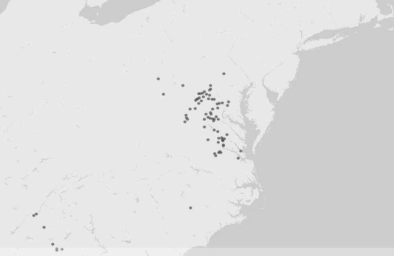
I used the same dataset as above with Palladio, which offers visualization options such as maps, graphs, lists, and galleries. I had some trouble trying to extend the Battles to include their location coordinates, but after reading the FAQ I realized that I needed to identify the new data as “place, coordinates” for it to display properly. I was able to create a moveable graph with the nodes (the units) connecting to the battles, and with the location coordinates I was able to see the battles displayed on a map. Unfortunately there are no embedding options that allow for interactivity, so I’ve taken a screenshot of the map. On the live version, you can click on on hover over each dot to reveal the name of the specific battle.

Palladio screenshot, map view

After playing around with RAW and Palladio, I took a shot at Gephi, which requires a download and installation. Even after re-reading Elena Friot’s tips and personal experience with Gephi, I still didn’t quite grasp its usefulness. I added the data in as described, but all I got were a cluster of dots that I didn’t know what to do with. I much prefer the more user-friendly interfaces of RAW and Palladio, and I’m trying to think of ways to use them in my own research. I could try creating a dataset from the Henry Schweigert diaries that link the diary entries by date to locations in which they were written, or what subjects are mentioned in them, in order to gain a different perspective of the overall patterns in the diaries.

Visualizing Networks

This week’s readings on networks started off a bit confusing to me, but by the time I ended up at Weingart’s Networks Demystified series, I felt like I had learned the ins and outs of networks, more or less. I had never given much thought to the visualization of networks, nor how historians, humanists, or social scientists have been using them before, which may have explained my bewilderment with some of the week’s articles. I’ve come to understand that networks are basically connections between things, usually people. However, there can be many factors that play a part in these networks that we as historians should try to take into account.

One example, cited by several of this week’s authors, is John Snow’s cholera map showing how the 1854 outbreak began in London. John Theibault writes that Snow’s map presented a narrative, as well as analysis of the epidemic, and leaves it at that. Meanwhile, Johanna Drucker takes Snow’s map a bit further, putting into question just who all those dots were socially and demographically, as well as providing us first with a street map with plotted dots, and an updated version of the map that replaces the dots with actual humans. The human figures on the map help illustrate that each dot from Snow’s map represents a single individual, reminding us that there is more information than meets the eye in all data.

What has helped me understand the purpose of visualizing networks were Klein’s article on archival silence and data visualization in regard to Thomas Jefferson’s communication with James Hemings, who was Jefferson’s slave and chef, and the Mapping the Republic of Letters project, in particular the case study of Benjamin Franklin. Both utilize correspondence data to show patterns of communication. In Jefferson’s case, although he did not directly communicate with Hemings, the digital version of the Papers of Thomas Jefferson contains an editorial note about Hemings, as he was mentioned in his letters to other people. From this, the author was able to chart the frequency Hemings was mentioned and also in which correspondence he was referred to. This visual aid helps to show us how Jefferson communicated about Hemings, which would not be known if only relying on letters written directly to him, which were none.

More general patterns can be seen in Franklin’s letters, such as which country he was receiving letters from most during a particular time frame, what kinds of people he was corresponding with (professionals, artisans, etc), and his top correspondents. This approach helps answer questions about Franklin’s correspondence that might take large chunk of time to extrapolate, which is one of the benefits of visualizing networks.

Playing with Patterns

I tracked the usage of the word “railroad” with Google ngram viewer, Bookworm: Chronicling America, and NYT Chronicle and found some interesting results that you can see for yourself below.

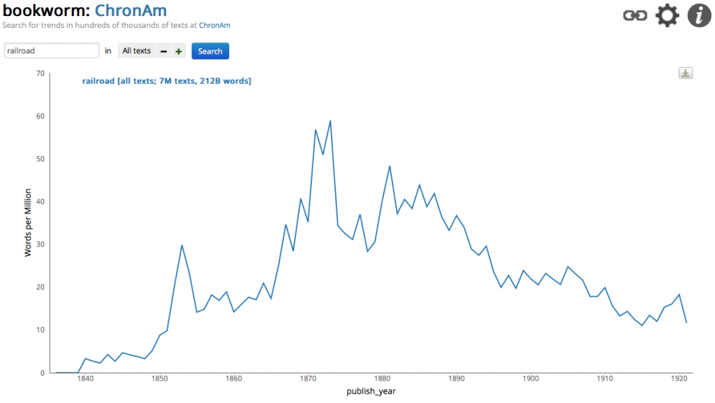
I wanted to see how the word railroad appeared in historic newspapers from the Library of Congress’ Chronicling America collection. I was able to view results from 1840 – 1921 with  Bookworm: Chronicling America and saw how the word railroad peaked in 1873 with a frequency rate of 58.9. I expected a larger spike for 1877, the year of the Great Railroad Strike, but this it could be a reflection of the newspapers available in Chronicling America. The Panic of 1873 could very well be the reason for the highest rate of the word I search, since the depression followed a large boom in railroad expansion.

Bookworm: Chronicling America, railroad

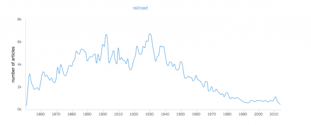
With NYT Chronicle, which only tracks the usage of words in the New York Times, I noticed a different pattern. I changed the default setting to reflect the actual number of articles that mentioned railroad and saw the highest amount in 1930 with 6,763 articles, followed closely in 1902 with 6,682.  In 1851, the earliest date available, we see that there were only 357 references to railroad. During the Panic of 1873 there were 4,015 articles that mentioned railroad, after a period of steady rising through the Civil War. After the peak in 1930, a steady decline can be seen, eventually getting down to 616 articles in 2013. So far, in 2014, there have only been 465 articles with the word railroad mentioned.

NYT Chronicle: railroad

I used two terms when searching Google Books’ ngram viewer, train and railroad, just to see how they compared. Except for the earliest years searched, 1840 -1860, the two words show up almost with the same frequency, except for a slight dip with railroad between 1890 and 1900. With Google Books, we can’t see where the words are coming from, which is truly a case of distant reading.

When compared to Voyant, the ngram viewers mostly obscure the content that is being text mined. With Voyant, you see the entire corpus that you select to upload, and then see the pattern within that text. For my Voyant example, I uploaded the text of the 1869 diary of Henry Schweigert, a farmer/college student who lived from 1843 – 1923 in southeastern Pennsylvania. He kept diaries from 1869 – 1881 and I have been in the process of transcribing them and so far only have 1869 completed, the year he attended the now defunct Palatinate College in Myerstown, PA. I was curious to see what the patterns were with this text, as I was relatively familiar with the content.

As I expected, the words day and nice show up frequently, as well as college, home and Myerstown. Schweigert’s diary entries are brief and focus on the daily weather, his location, and any events or activities he had during the day. I removed the typical stop words such as the, and, and also the year 1869, as that showed up quite often as it was mentioned in every entry. Other noticeable words are church, excelsior (he was a member of the Excelsior Literary Society), brother and thrashing (as in thrashing wheat).